Hey there, you. Yeah, you right there, looking at my portfolio site right this instant. If you want to contact me, email me at:
Quick Blurb: Currently designs more for the web than print, but would like to change that • Envisions one day being part of a [creative] team that kicks ass and cause terror • Hopes to work on projects that kick-ass and cause [thought-provoking] terror • Bicycling through traffic is thrilling • Karaoke is stress-relieving • Clever arrangement of spatial shapes on a canvas, in black & white, is great • Ink on textured paper is interesting.
About this site: Built upon Zurb's Foundation, with jquery scripts out the ying yang. I want to thank front-end developer, Michael Marakov, for figuring out all the javascript and animations and putting the structure of this website together. This is the fourth iteration of my online portfolio.
I'm also lurking on Flickr, Behanced, and DeviantArt, so catch me if you can.
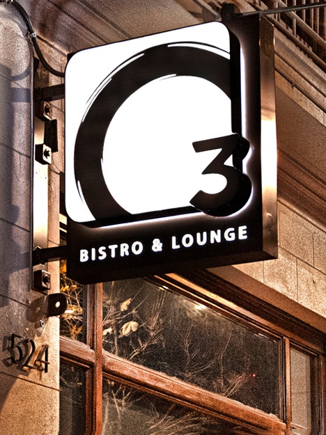
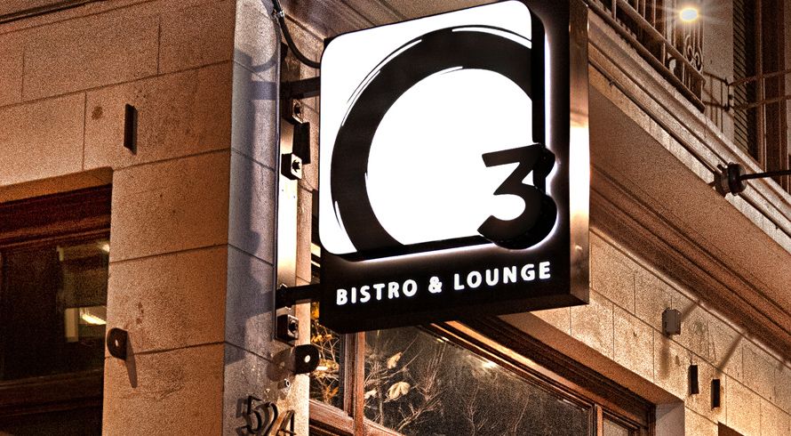
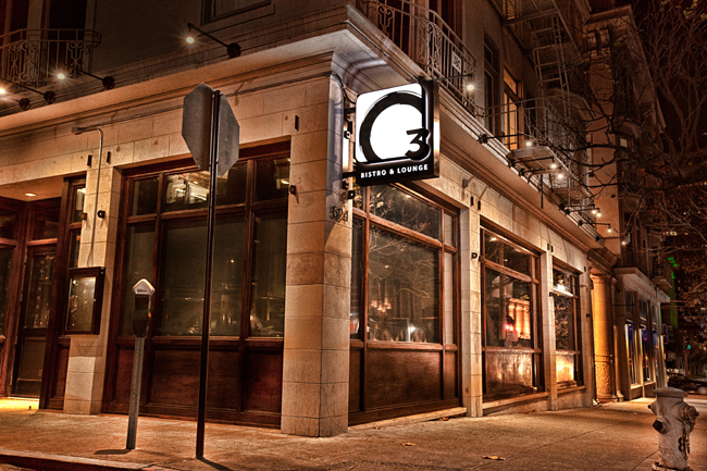
1 outside signage: 400 led lightbox, steel/alumnium metal, laser cut, black acrylic
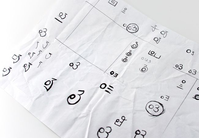
2 sketches after chosen direction
3 three main variations, went with the left one
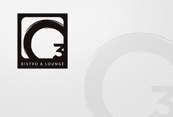
4 final logo with two different ways to apply it
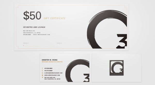
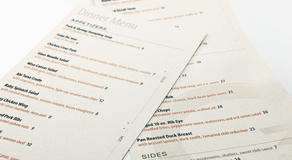
5 O3 business cards, gift certificate and a few menus
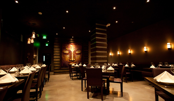
6 bonus pic: photo-retouched and manipulated a rectangle buddha image into a square-ish frame with as less cropping as possible. Many variations and time spent. 5 x 6 feet.
× Close ProjectThis asian fusion bistro next to the San Francisco City Hall wanted to leverage it's prime location towards politicians & symphony goers without putting off young professionals. Working off the interior designer's decor plans, typeface and colors were chosen to compliment the inside, as were the creations of the menus and logo.
While the bistro serves food of asian influence, O3 does not pretend to be authentic asian cuisine. The bistro's intent was to be more of a modern and contemporary lounge/bar/bistro atmosphere, with the asian fusion food being the unique selling point. With that in mind, we agreed that the brandmark should be something that is contemporary, but also shows a nod to eastern aesthetics.
Letting my mind free form in the early sketches, the eastern aesthetics was applied heavily. Since O3 is pronounced, OH three, I was very draw into emphasizing the letter “0”. Circle shapes are common in asian writing, so a less geometric “O” was the next step. As for the “3”, I chose to go the opposite direction and back to the future with a geometric “3” (font Gotham Black).
Eventually three distinct directions were realized
. The left one fell along the lines of the period table element, Ozone, which abbreviates to O3. I should probably mention that the name of the bistro comes from the fact that one of the bistro's partners own two separate restaurants in the city called Ozone and Ozone 2 [with no relations to O3 other than namesake]. Continuing along, the middle option's direction goes 100% into asian influence. While not completely on target with the original objective, I felt that a solution could be found with future permutations. The last one aimed at more geometric shapes, with the letters forming bold, thick lines, while the line over the “0” help slighting dissolve the letters into a foreground/background interaction.After much discussion, the periodic table element direction was the one chosen for more exploration.
After some more refining of shapes and new obstacles addressed (such as the outdoor signage having to be a retangle shape), the O3 identity is realized into two variations of the same graphic mark. The rectangle version is reserved for mediums that need O3 to have instant recognition and places where white space is restricted, while the O3 that is cut of to the bottom right side of any canvas is reserved for mediums that allow for more white space interaction.
In terms of color of the logo, the gray is derived from the outdoor signage maker's recommendation to ease the making the sign. For the type used on the menus and other collateral, a orange-bronze color accentuate the interior decor and atmosphere. There is also a orange gradient version of the logo for projects that need something more vibrant.
The typefamily used is Myriad Pro, because the condensed font exudes prominence while being approachable. Also add that fact that the rest of Myriad Pro is a font that the O3 marketers have easy access to it when they need to write something out on Microsoft Word.
The two logo variations made it very flexible to apply the identity onto print and and web/digital collateral. The non-boxed logo interacts with supporting typographic elements. It can be bold on a business card, or it can play second fiddle in on the dinner menu. The boxed logo serves well for internet social networks or usage as an emblem. Check out everything in it's entirety for yourself the next time you're near San Francisco's City Hall; O3 Bistro & Lounge.
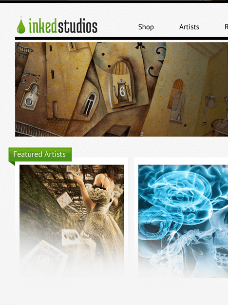
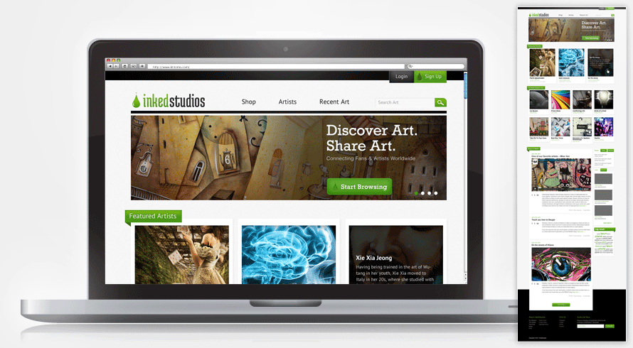
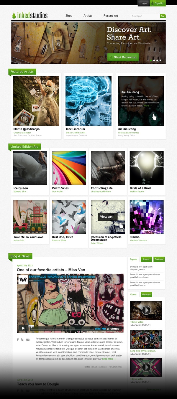
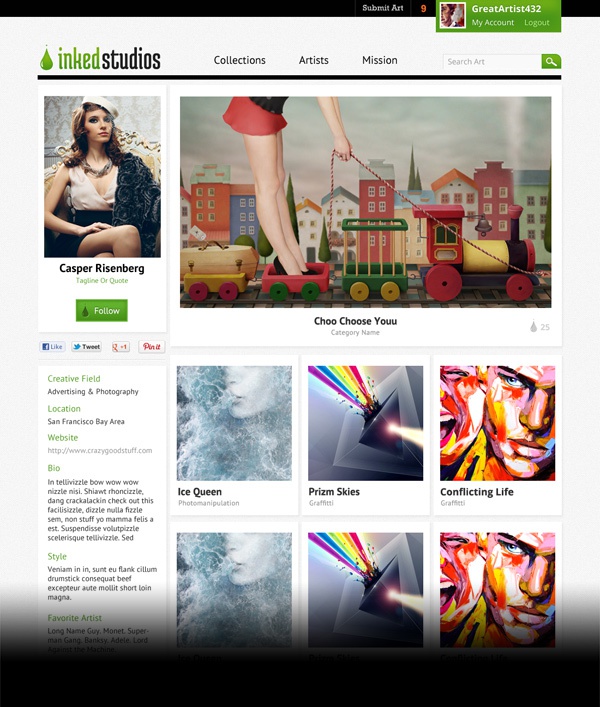
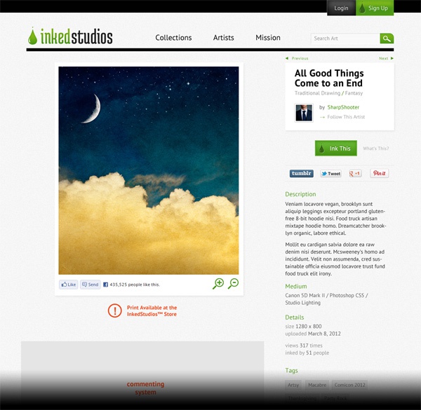
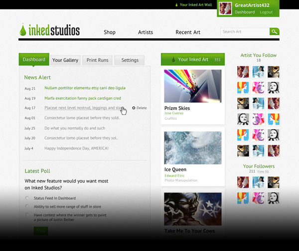
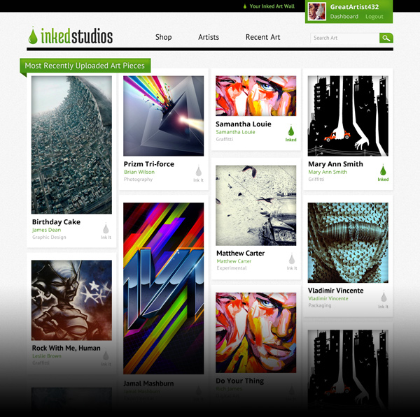
Inkedstudios.com aims to build an online art community while promoting up-and-coming artists, particularly those of urban & street art. With the ability for artist to create their own galleries and have viewers collect or share them, a easy-to-follow interface that's approachable and flexible is key in the early stages of the site.
With art sites like behance and deviantart, not to mention all the niche art showcase sites, why should any viewer care for another one? I suppose from a consumer prespective, they're all the same. But to someone with knowledge of the behind-the-scenes, Inked Studios has an interesting way in approaching this field.
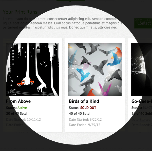
Inked Studios isn't trying to take on the big boys; it wants to work with established and up-in-coming [local] artists one-on-one. The idea is to find an artist (in this case, in the San Francisco Bay Area), work with them to create quality print poster/canvases, and then sell them to Inked Studio's audience and through social media networks. Currently the audience is being gathered organically via a Facebook fanpage, where art is shared with the followers. With a decent following so far, the next step would be to introduce them to a Inkedstudios site, that is where I come in.
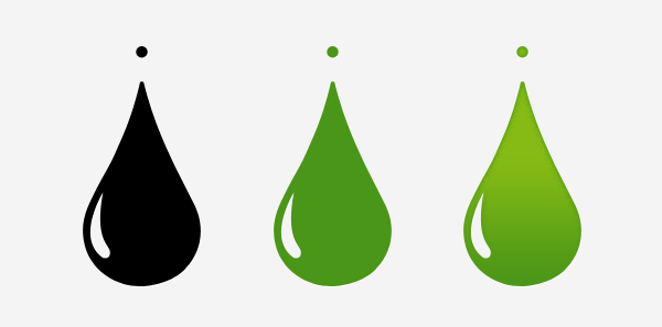
The color of green was established beforehand as the primary color for the brand. The next thing on the list was a strong brandmark. It was important that the graphic be strong and elegant, as it will be used in key elements on the web and in print collateral. After many variations via a few different internal designers, it was settled that the Ink Studio brandmark be..you guessed it, a ink drop.
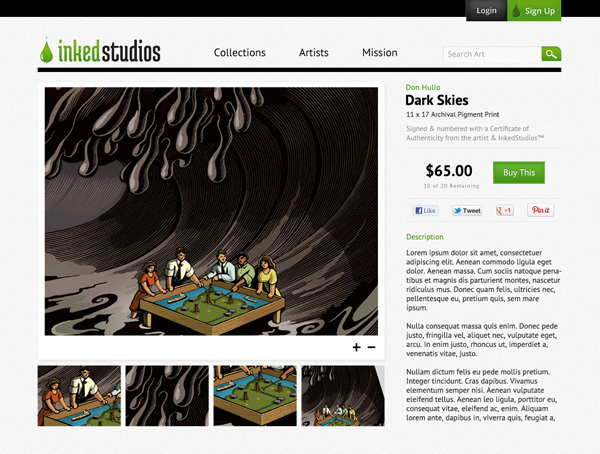
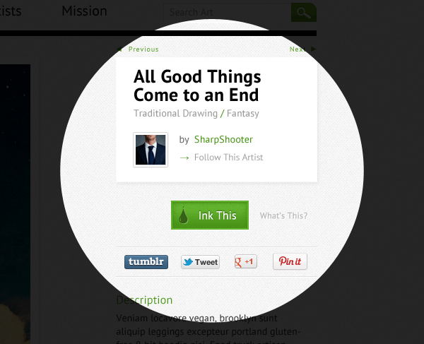
Cliche? Perhaps. But in this case, this icon can be prominently apply to many mediums— from being stamped into a certificate of authenticity for art prints, to use as a call-to-action button for the site.
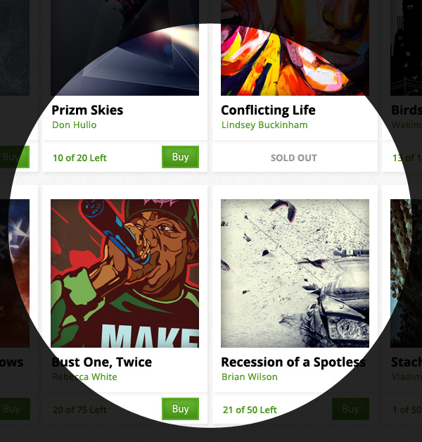
As for the site layout it self, the goal is to let the art speak for itself, while strategically creating a visual hierarchy of featured art pieces. A key concern was how we would allow the viewer to share the art easily while finding a reason to create an Inked Studios account.
I want to note that all the images used in these mockups are from stock image sites or grabbed without permission from other art sites. No images grabbed from the other art sites are being used commercially or for profit; only being used in my mocks.
× Close Project