firstnamejohnson.com

    // Portfolio of Johnson Chen   ┈   Abridged for Smaller Screens

←   Back to Showcase
firstnamejohnson.com

    // Abridged Portfolio for Smaller Screens

←   Back to Showcase

Fitsoft aims at two groups:

Businesses: a web platform for gym/fitness facilities to manage all their activities, website content, and customer & staff—all in one digital space.

Public Audience: a search directory for locals to find gyms and join classes right on the spot. Put that directory onto the web and mobile app, and a combine that undisclosed strategy to engage the masses.

An opportunity to take this market is possible with the right product. Fitsoft hopes to do just that.
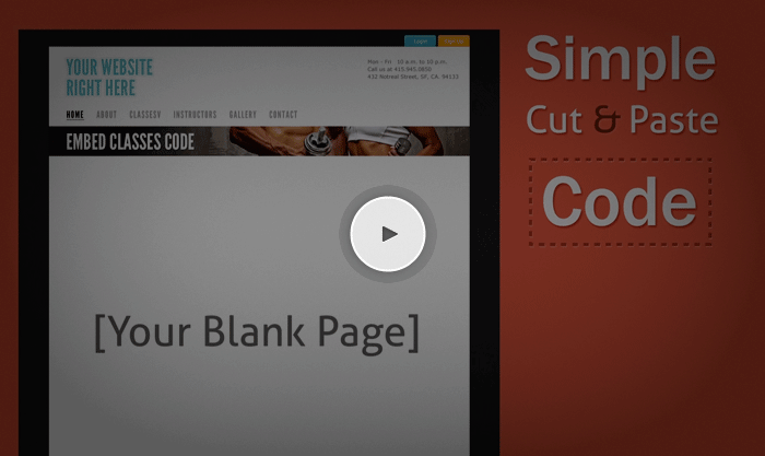
  Intro video aiming at fitness facilities

Obstacles / Direction

In a broad and general perspective, the targets for Fitsoft are people who like exercising and the businesses that provide exercising activities. As I've learned in academics, selling your product to businesses (also known as “b-to-b”) has distinct differences compared to selling to consumers (a.k.a. “b-to-c”). I'll admit, creating a brand identity in both b-to-b and b- to-c is quite task to undertake, especially working with limited resources for a product that is still in a inchoate state (in pre-beta development).

After comprehending the situation and limitations, the best plan for action was first to start on an basic flexible brand identity that can be applied to the Fitsoft product aiming for fitness businesses. Appealing to regular exercising folks are also on my mind, but leveraging two identities would not be a good idea for our small team.

Brand Identity

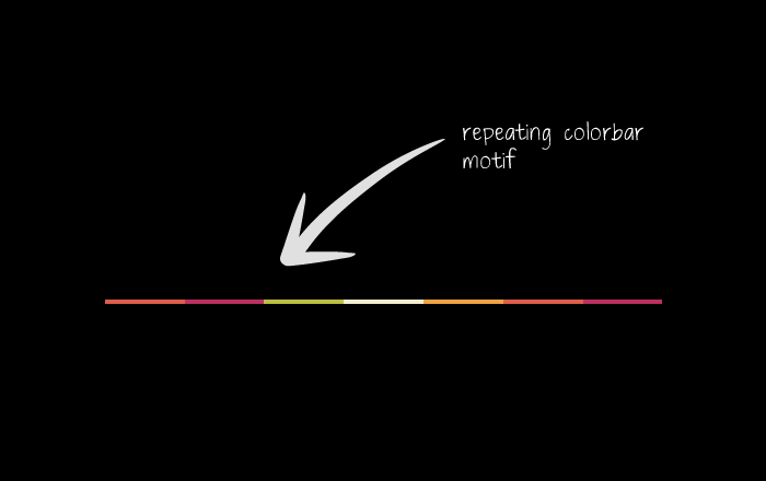
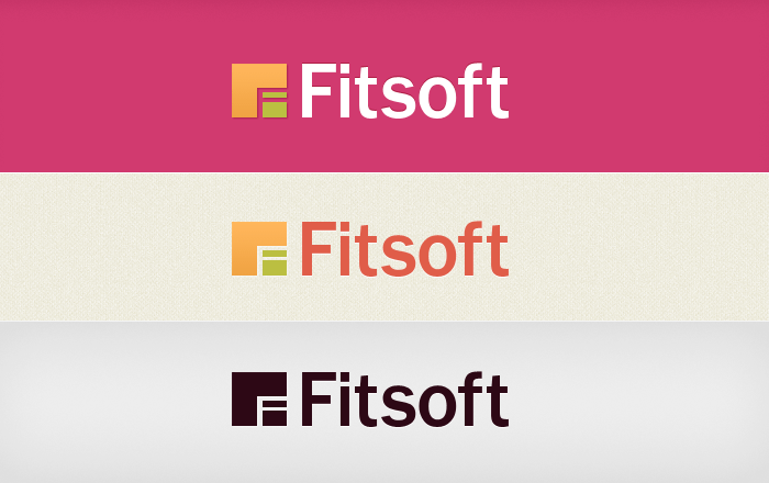
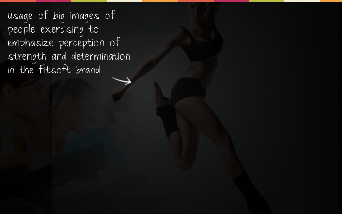
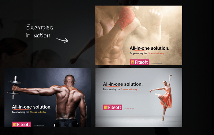
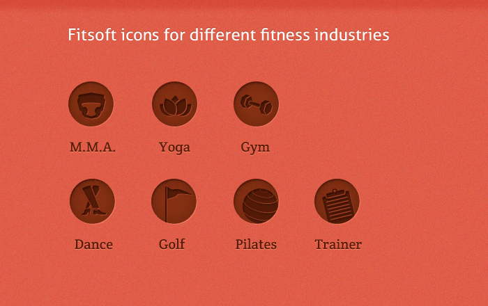
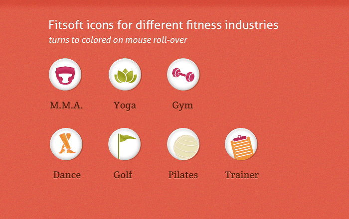
What does color does one think of when talking about fitness and exercise? That was one of the first questions I asked myself. What color appeals to people who practice a calm activity like yoga, AND to those of the more physical mixed martial arts? The solution was not just a specific color, but a specific color palette.

Continue Reading  

The Needs of a Fitness Business

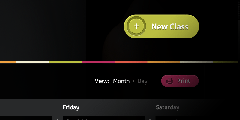
Most gyms, small fitness operations, and small businesses in general are not tech-savvy people; they tend to shy away from new ways of running things, as it is easier to stick with with the old than learn what's new. But if there is an easy solution that works, people will jump right onboard. Fitsoft aims to create and design products where the user interfaces are easy to learn and use. That includes simple website templates, a lean GUI to edit those websites, and other platforms to manage your customer, staff, and classes.
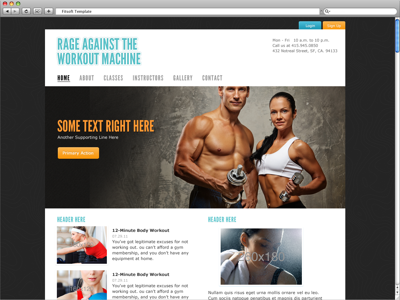
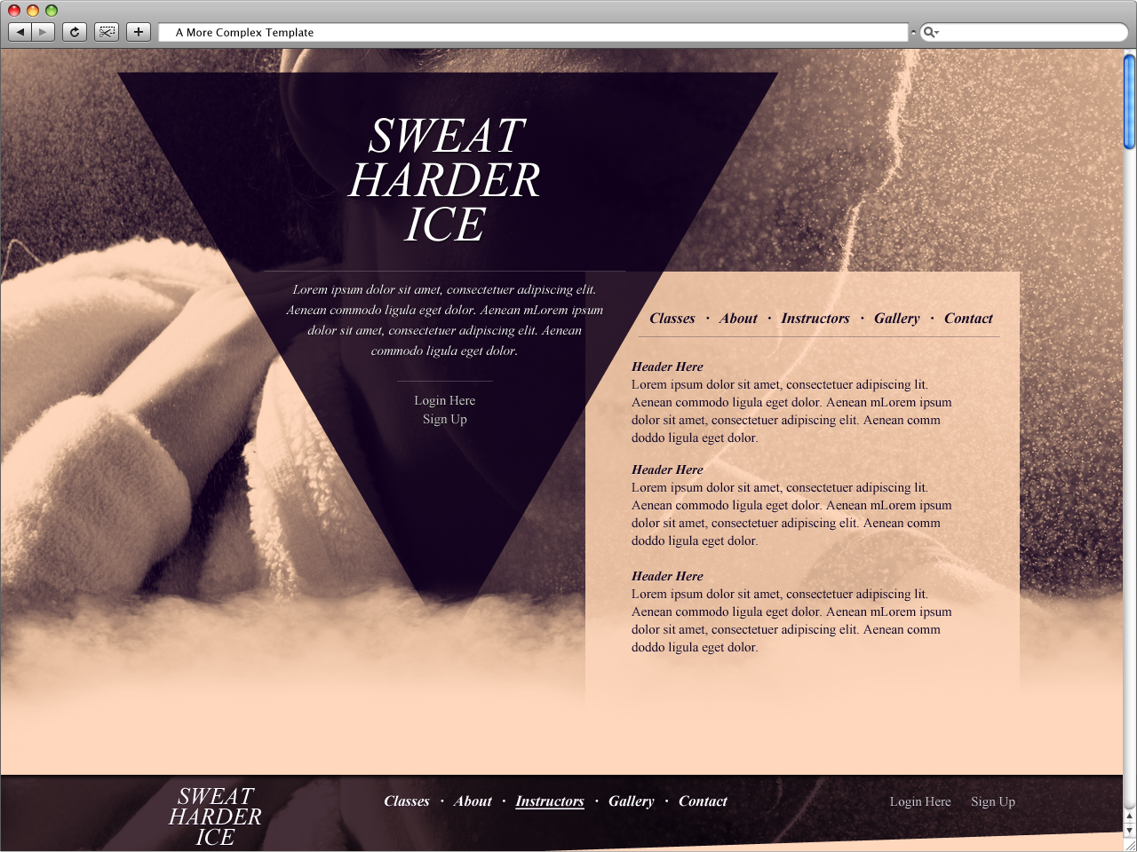
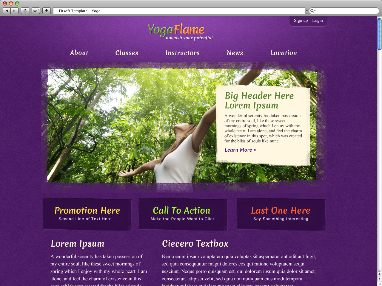
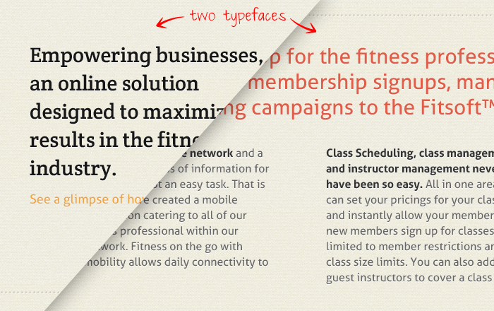
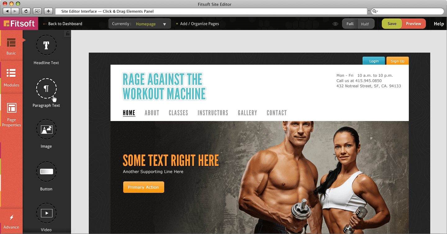
Website Templates

Straight forward fitness templates for businesses to use. For quality control in the initial stages of this project, most of the templates has a max- width of 960px, but also are responsive to smaller screen sizes.
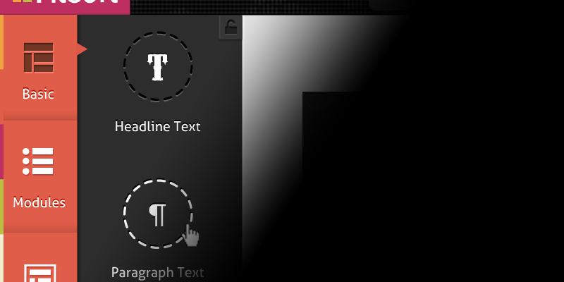
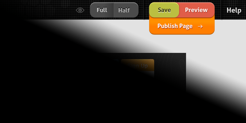
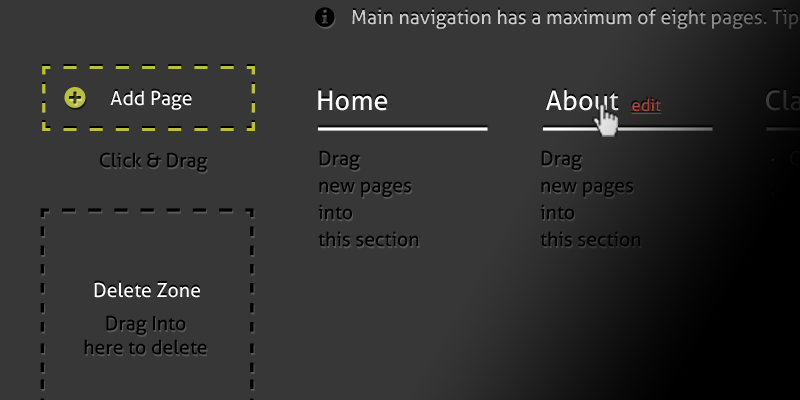
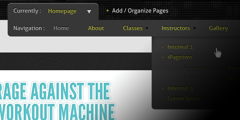
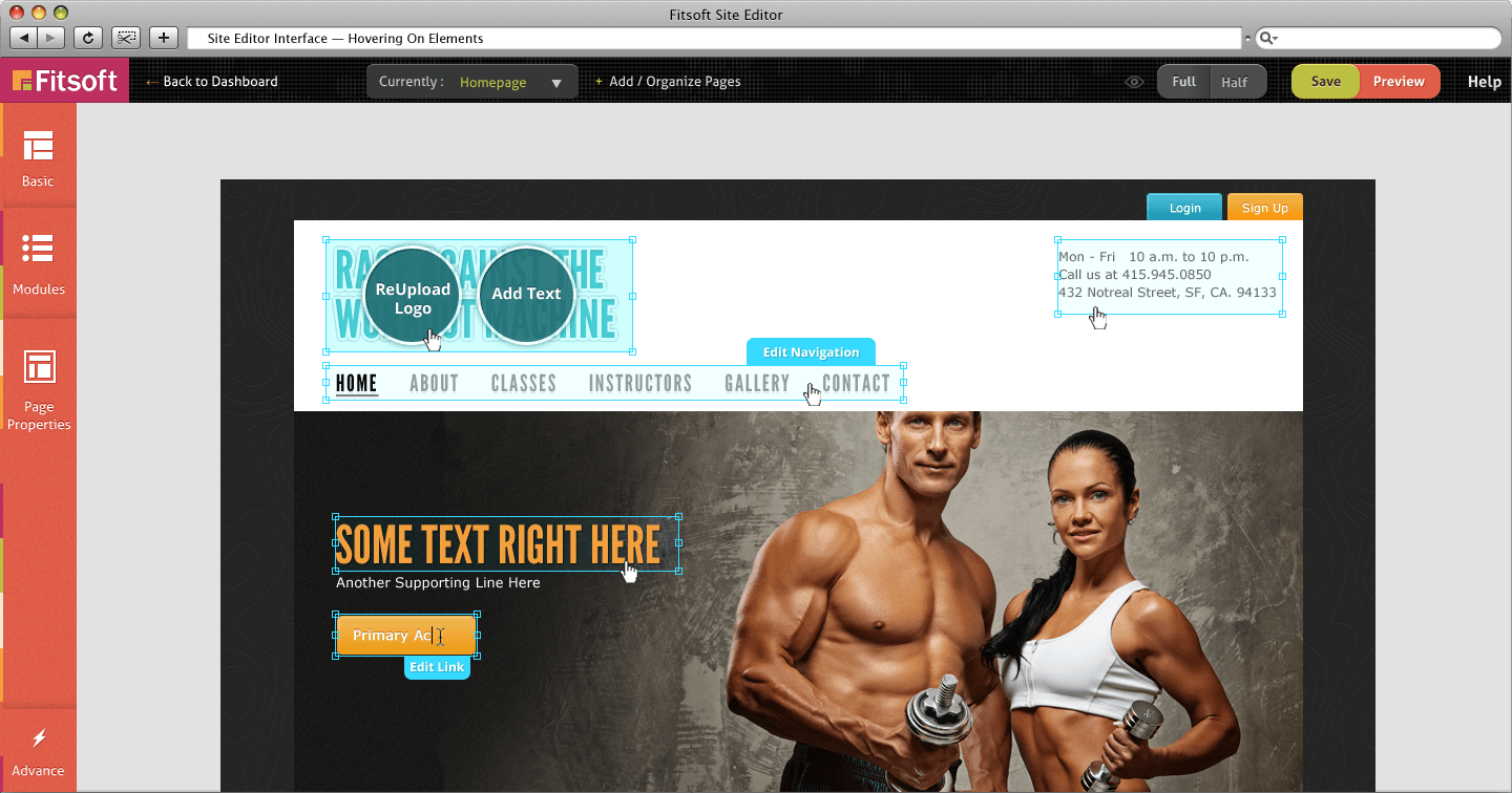
Website Editor GUI

Most people would like a lesser learning curve when it comes to technology. The template editor’s interface is designed to focus on the core things that fitness businesses need to edit.

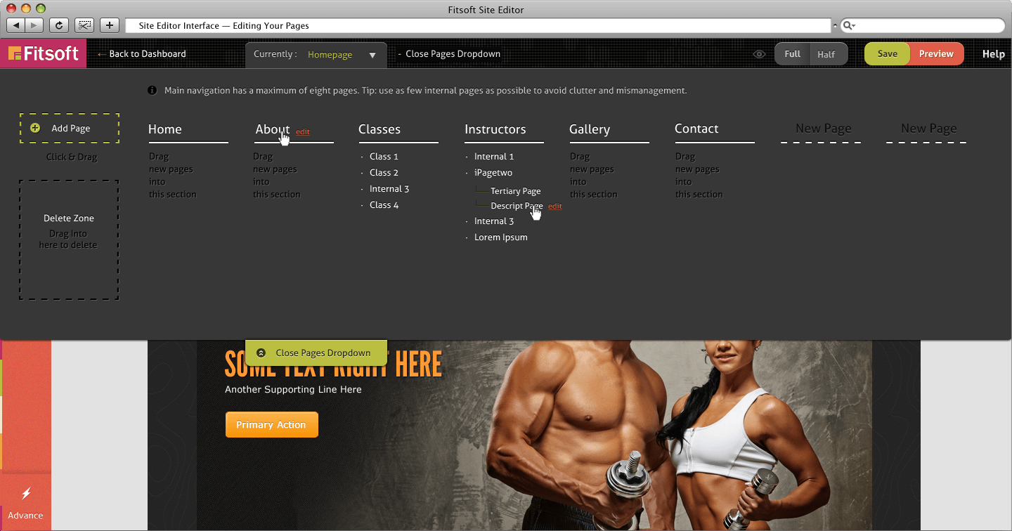
Note: Not shown are the interfaces to edit staff, classes, and other business management sections.

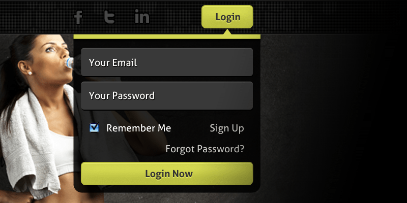
The Fitness Audience

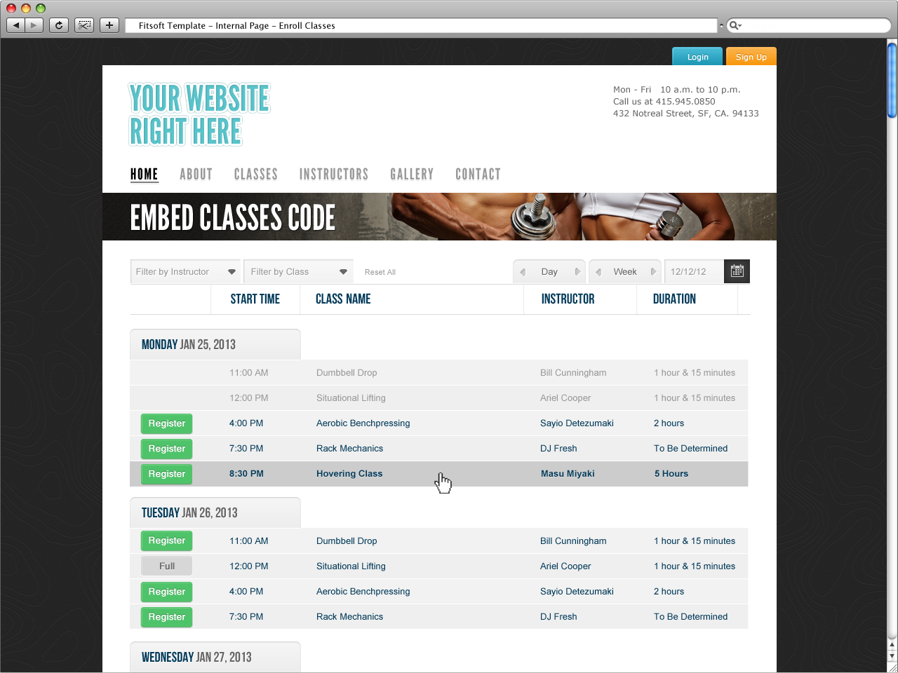
To target people who exercise frequently and those who are interested in trying new fitness activities, the Fitsoft directory system is created just for that. The goal of the directory is to let people find fitness facilities in their area, as well as discount & promotions. If the facility is associated with Fitsoft, the users are able to enroll in classes or membership immediately. A Fitsoft mobile app and other undisclosed strategy is created to encourage reoccurring user interaction with the directory.
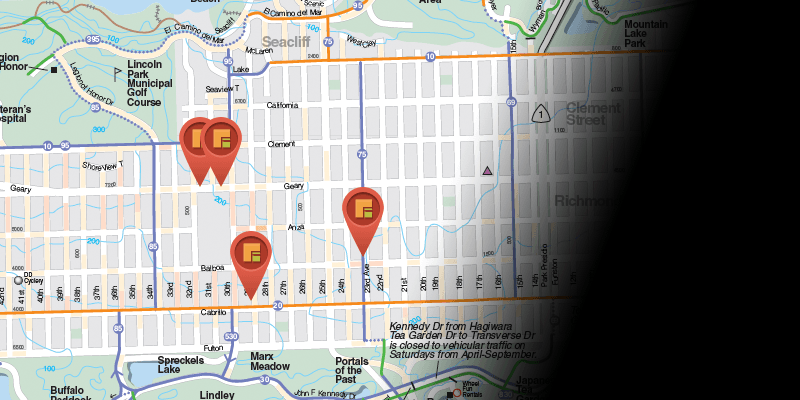
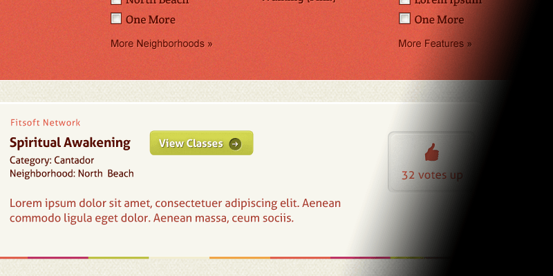
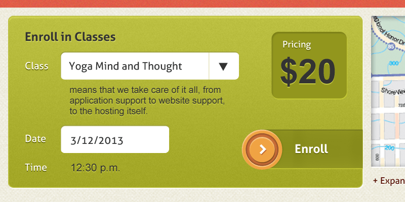
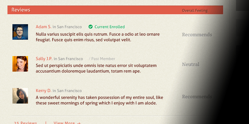
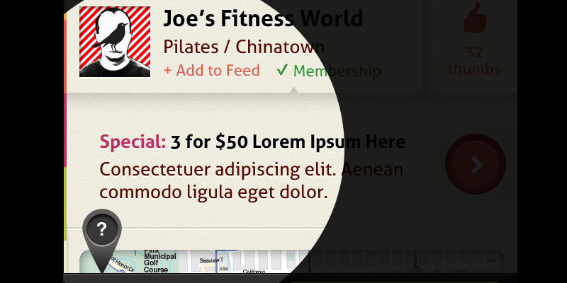
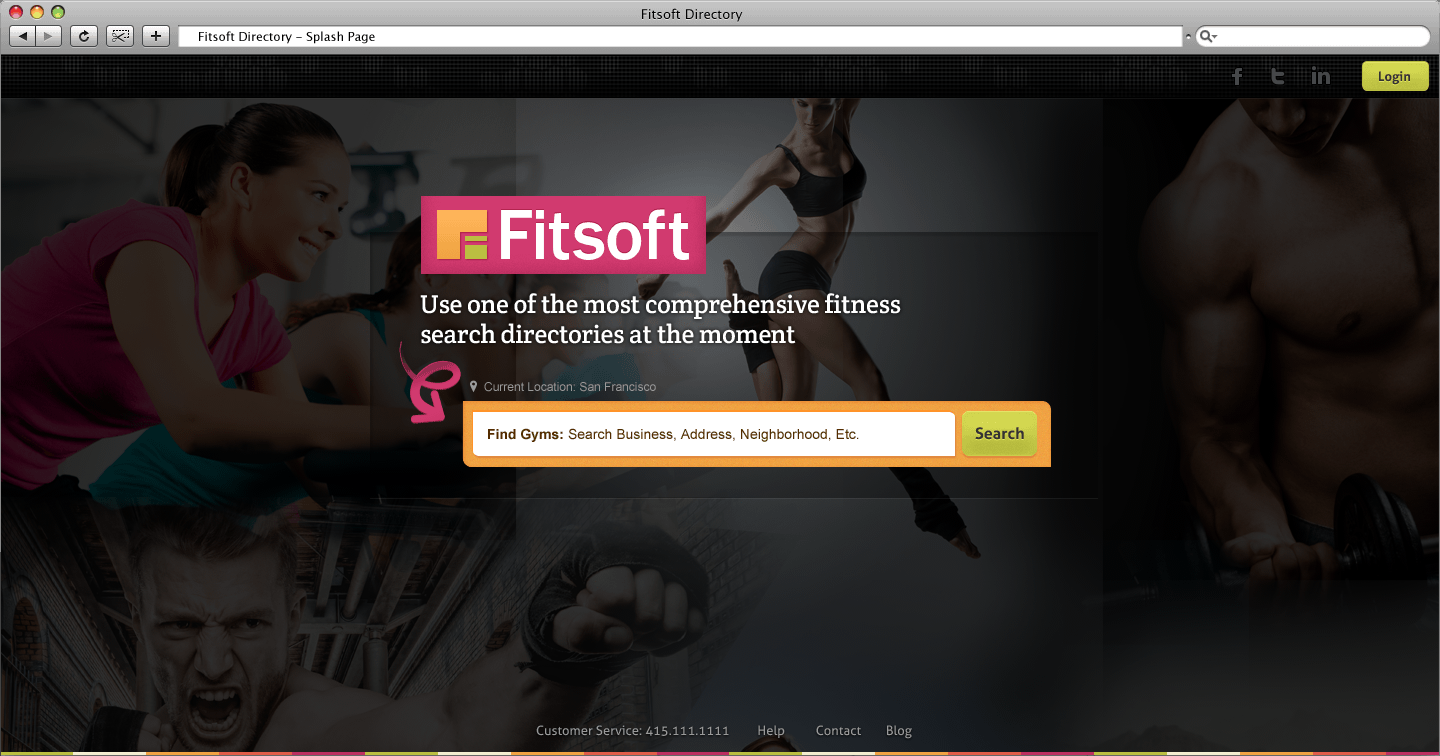
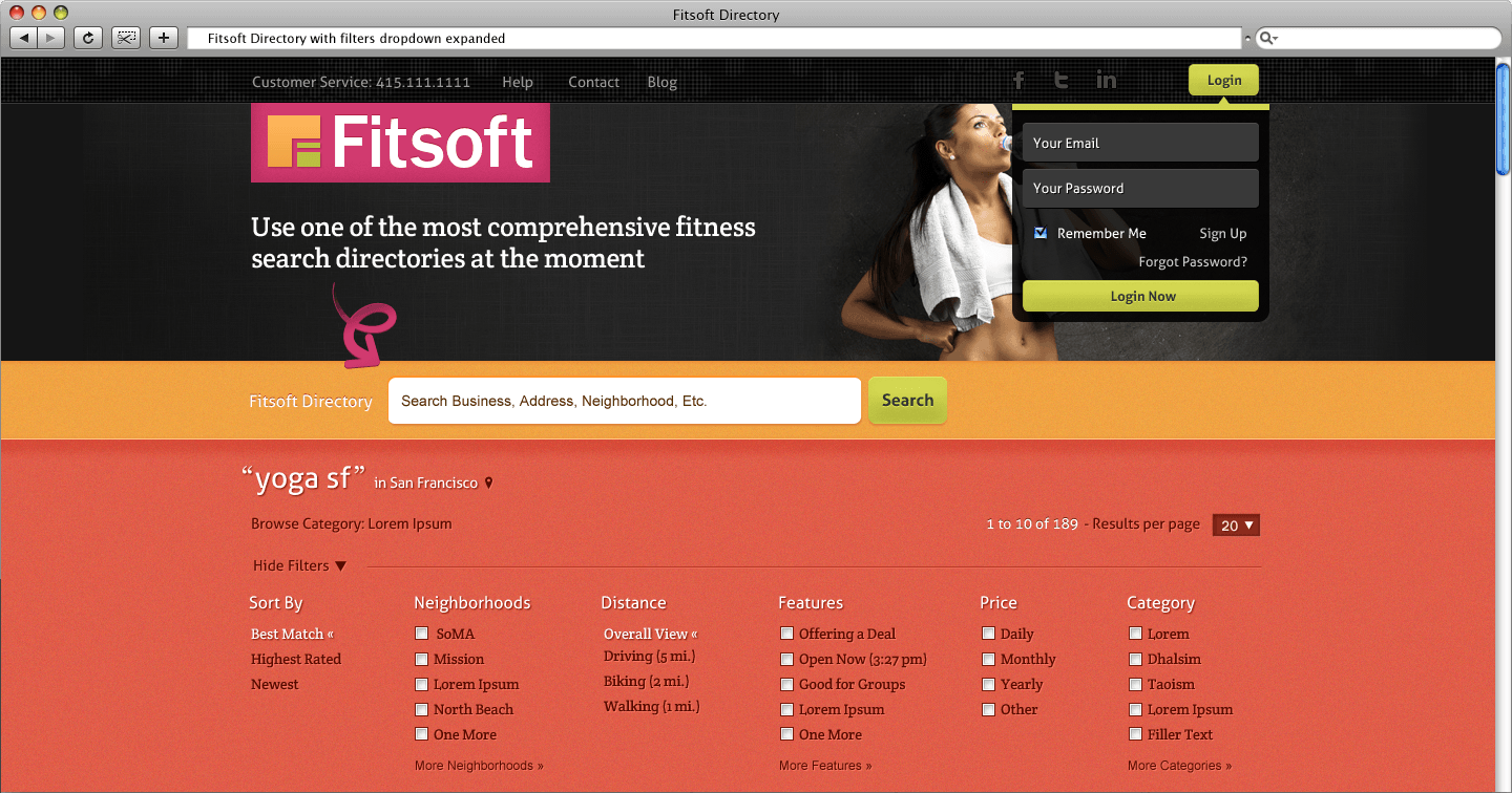
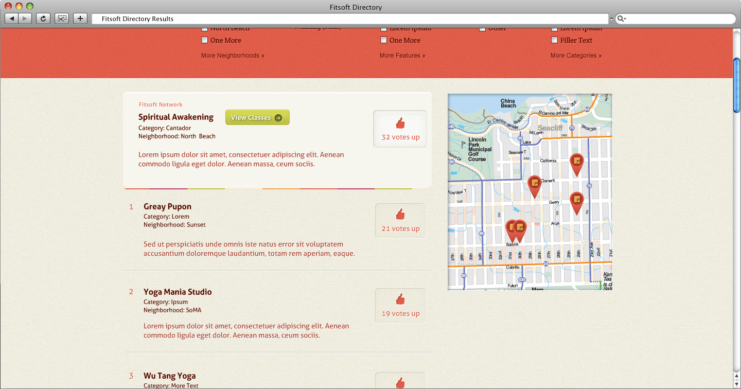
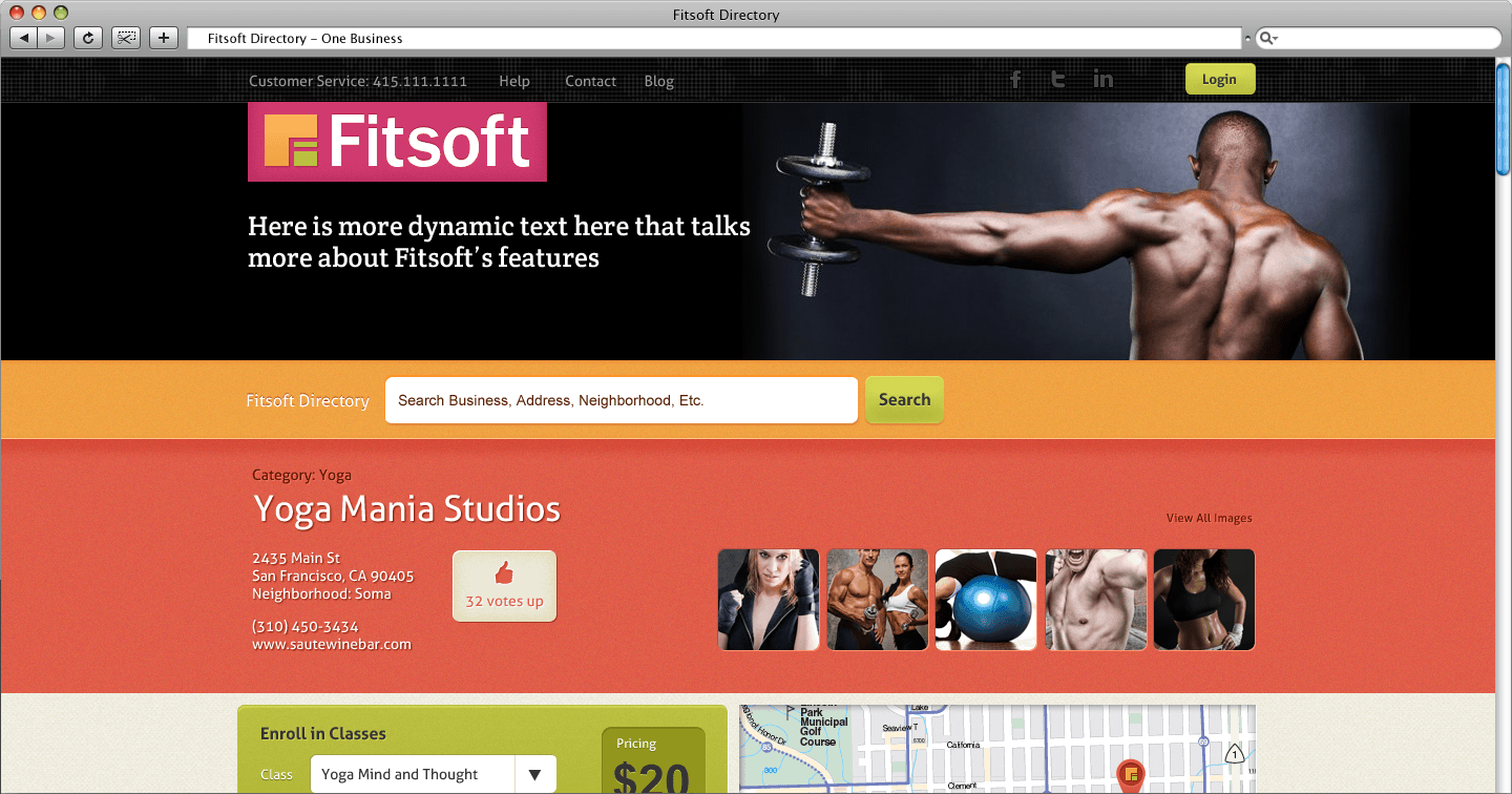
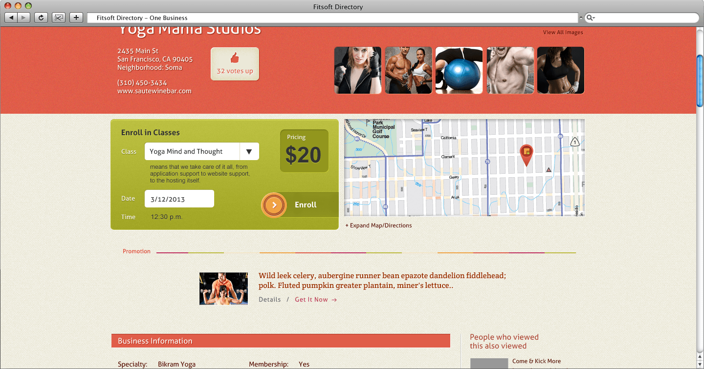
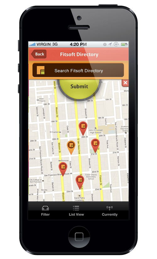
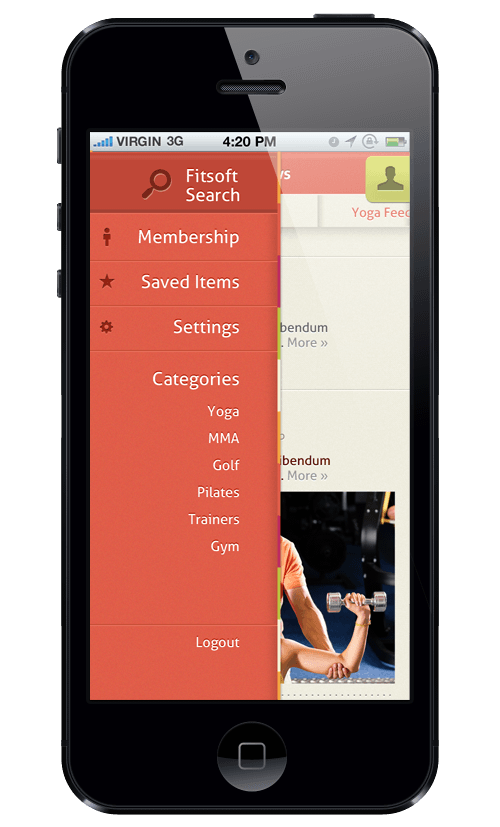
Fitsoft Directory

A place to search all fitness businesses in your area. Fitsoft clients on the Fitsoft Directory has the option of letting their users sign-up for classes immediately on the site. Consumers can also manage their membership account on the directory.
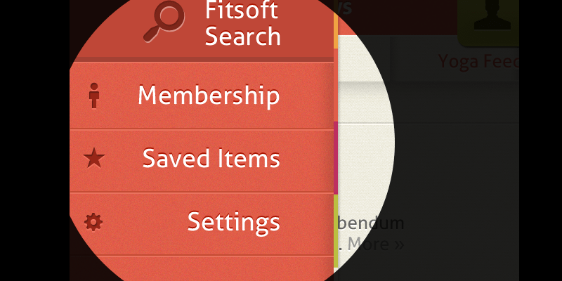
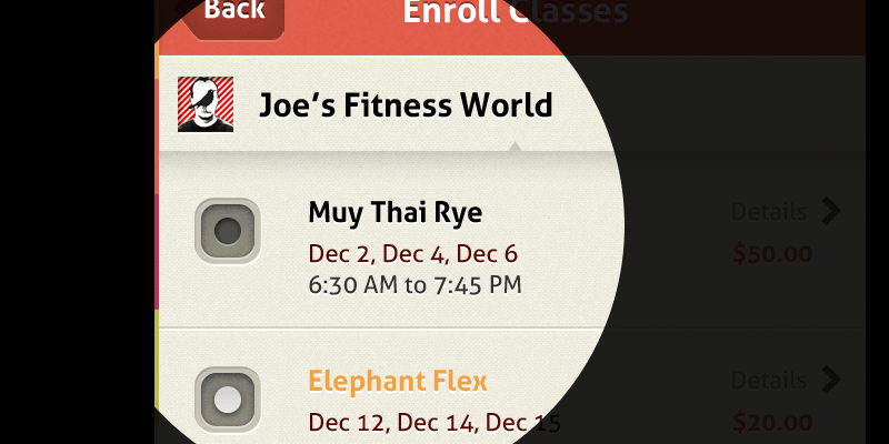
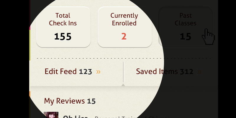
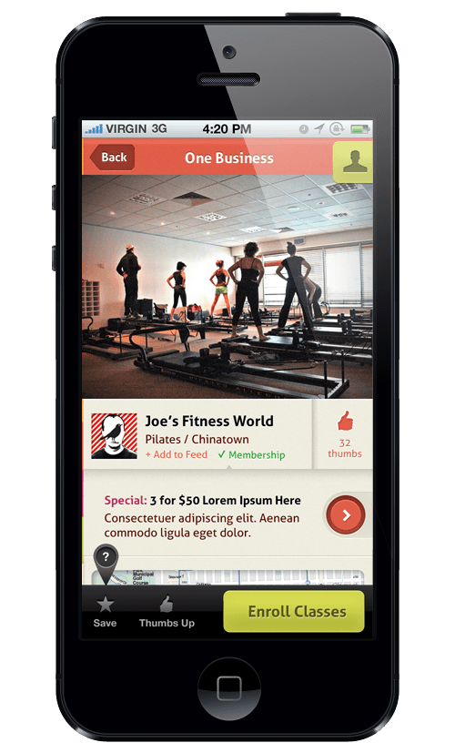
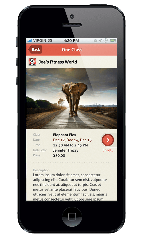
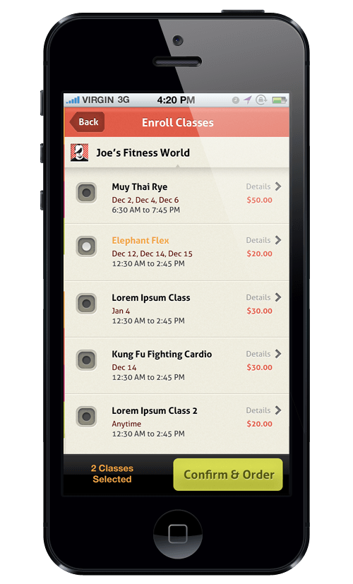
Mobile App

An extension of the Fitsoft Directory. Features includes scanning into your facilities, checking-in, and a news feed for deals and news from your enrolled facilities. An emphasis on a smooth check-out flow, from the start of discovering the class, to the finish of enrolling into it.

Moving Onwards

Fitsoft is alpha stage right now, with a few Bay Area fitness facilities as beta-testers. The majority of the main features are in development. With the brand identity in place, as well as the designs for the main selling points of Fitsoft, the next stage would be to get user feedback on what to improve, as well as what other needs that could be expanded upon to benefit a fitness-related businesses.

For best viewing experience, toggle resolution quality to 1080p

×

Fitsoft Brand Identity

Continued Thoughts

Color  With some image gathering, article research, and color palettes exploration, the five colors of Fitsoft were found. The key colors are the red-orange and orange, while the rest are more secondary in usage (more of accents colors). The reason being is that the red-orange and orange are more universal when relating to a range of exercises. The colors also might bring up a Gestalt effect for consumers, as the color combined with texture patterns conjure up reminders of padded walls/mats that are usually associated with fitness activities.

Logo  As for the Fitsoft logo (created by another designer), it works solidly with all the Fitsoft projects, but is very self containing logo. This attribute works extremely well for the Fitsoft business platform. With the directory, however, there will need to be other visual elements in place to offset the logo.

Typefaces  The logo and print collateral's typeface family is Franklin Gothic. Having traditional forms in the alphabets' shapes, Franklin Gothic compliments the Fitsoft logo's shapes. For the internet, web-optimized fonts such as Aller and Crete Round are used. Aller is reminiscent of Franklin Gothic, though more playful (which works with the website layouts). Not to be ignored, Crete Round is used sparingly for emphasis.

Imagery  The consumers we are targeting are trying to improve their individual bodies, as oppose to their friends' bodies. With that in mind, imagery that is used to accompany Fitsoft are those of individual people exercising, with the camera close enough to focus on the person's form and body strength.

×

Fitsoft Website Editor UI Details

Closeup on the UI elements. Be sure to read my thoughts on this.

×

Fitsoft Website Editor

Thoughts and Process

A click & drag website building interface is not a new product, as there are good ones out there on the web. The difference between this one and the others is that the Fitsoft Website Editor GUI limits intentionally limits it's features to the basic elements.

I've done this for a few reasons. The main one being that the users we are trying to reach do not need expert-level functionalities. Imagine it this way: you are a local gym business owner who did not have any web presence before using Fitsoft to launch your site and manage your members, will you want to start editing html?

With that in mind, the design and layout is made to get the site content up and running. Big buttons and elements, strategic colors, and hiding the advance options makes for a simplier learning curve.

The ability to edit the template is also restricted. Besides to limiting the customizability in the initial product so that it can be built quicker, the other reason, again, is so that the users we're aiming can't “break” the site layout. I want to make sure each website is presentable, as oppose to a 2006 myspace webpage where divs are floating awkwardly with random white-space sprinkled in-between.

×

Fitsoft Website Editor UI Details

Closeup on the UI elements. Be sure to read my thoughts on this.

×

Fitsoft Directory

Thoughts and Process

The frontpage is designed to affirm to the user that this is [at this early stage] a big directory, alla Google dot com. The frontpage also introduces the Fitsoft brand identity, with it's color scheme, repeating color bar, and big imagery of people exercising. These motifs will seen over and over again by the user if they continue using the Fitsoft Directory and other Fitsoft products.

Once the user searches for something, the results page appear. Currently, there will be a big image banner on top of the page, to again, reinforce the brand. When the Directory gets rolling in the future, that space will be condensed to show the results "above the fold."

The results page will promote the Fitsoft clients. Non-clientele businesses will still have their basic information displayed in the directory. Fitsoft clients can push promotions and let consumers easily sign-up for classes. Through some research, it can be concluded that most consumers browse businesses [of all types] to see if any deals are going on.

×

Fitsoft Website Editor UI Details

Closeup on the UI elements. Be sure to read my thoughts on this.

×

Fitsoft Mobile App

Thoughts and Process

With the rest of the Fitsoft products in embryo stages, having a too extensive of a mobile app would not be a smart move. The focus shift to creating a basic app that extends the Fitsoft Directory for consumers on their smartphones.

The primary actions for the consumer to make on this app is browse businesses and signing up for classes. To entice them, promotions & discounts for individual classes and gym memberships will be the main selling point.

With that in mind, a good flow and transition between browsing browsing/finding deals to paying for a class is the key to making this app work. I focused on cutting down the paths between getting from Point A to Point B, all the while making the CTA buttons prominent and appealing [for people to click on].

×