

Discover What's Better
What began as a daily-deal site for sustainable products & foods extended itself to a monthly subscription box of eco-friendly goods. That's when I came in—to create and maintain a Blissmo brand identity from print to digital, website to packaging. Along the way, new products/services were explored. As the main designer, I had to see through the conception to final mockups (coding was handle elsewhere).
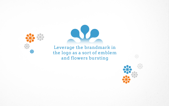
Brand Identity
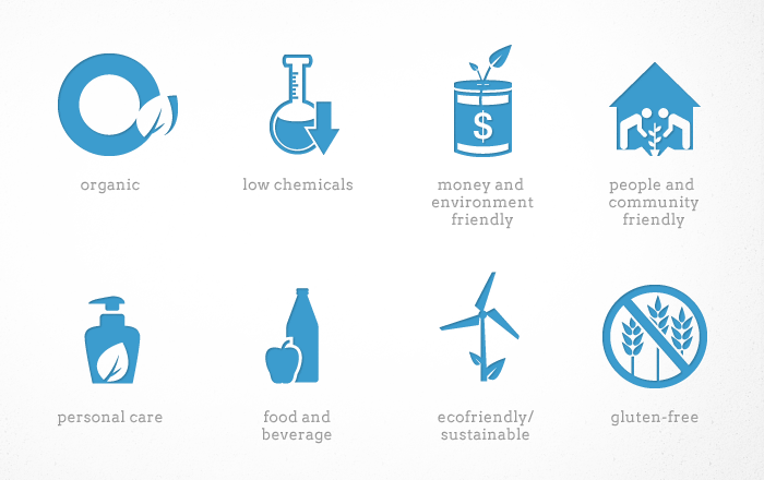
If the current audience is made mostly of young mothers across the country, how do you position a identity for a wider target audience without alienating your current one? For blissmo to be seen as "fresh," visual elements that evoke the feeling of "vibrancy" is key.
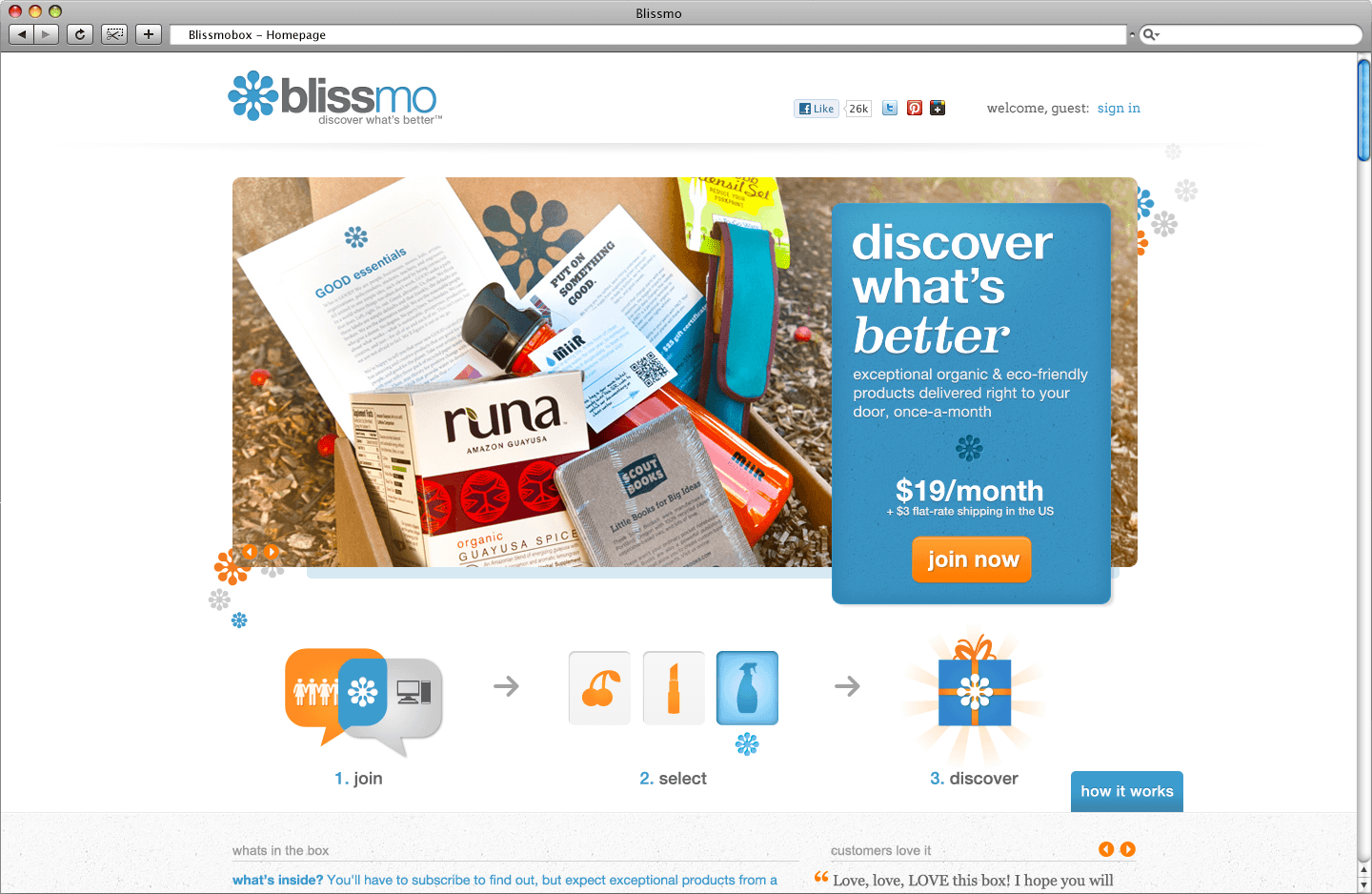
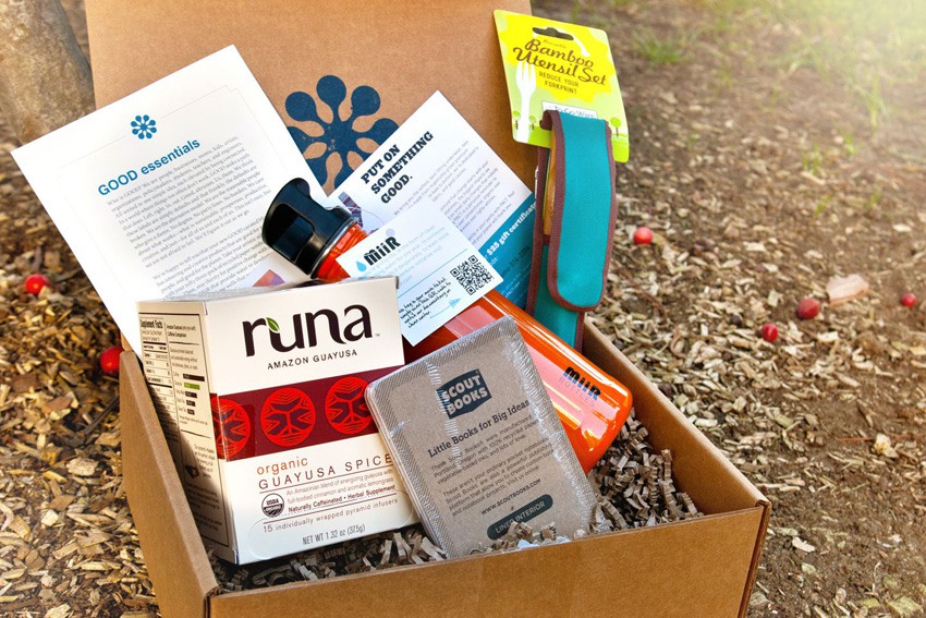
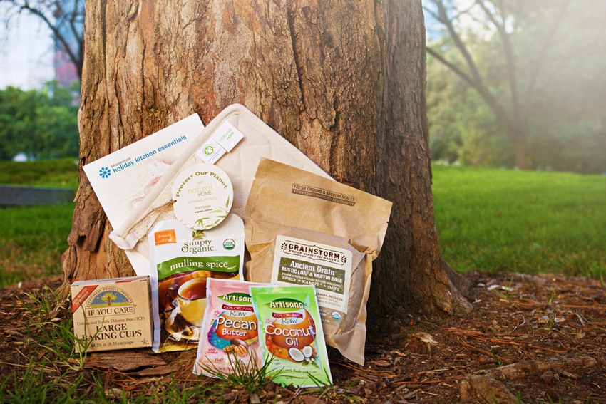
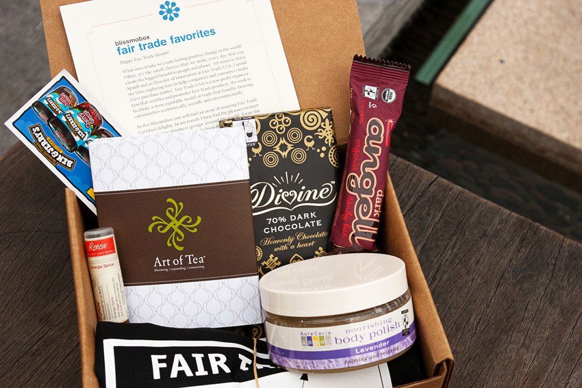
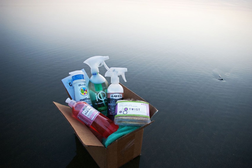
Blissmobox
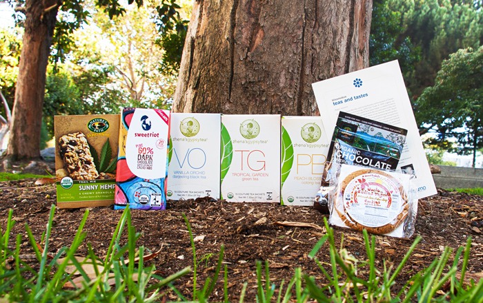
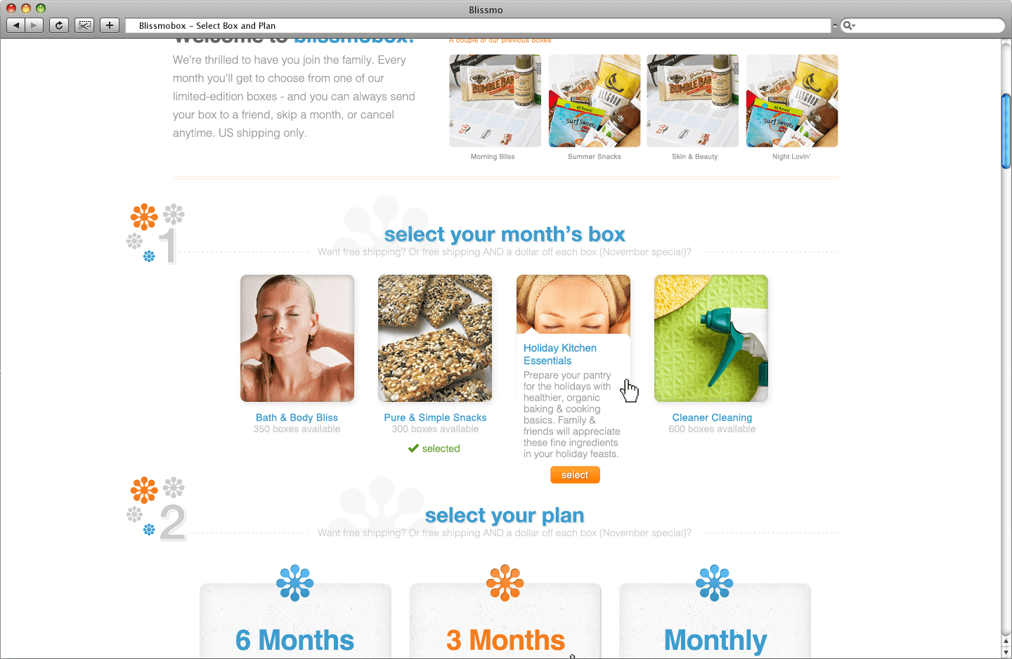
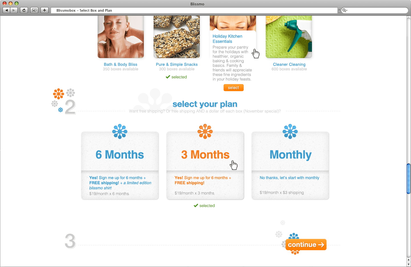
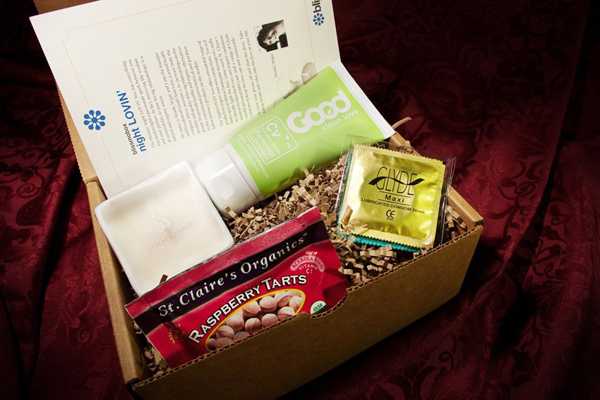
This box of sustainable & eco-friendly products/foods arrived monthly to people's doors. The fun about the blissmobox is that the receiver do not know what they are going to receive, but try the blissmo team to deliver trustworthy eco-friendly goods once a month.
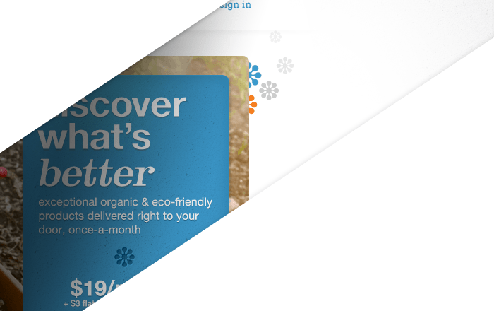
blissmobox Website
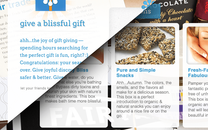
Although the element of surprise is what receiving the blissmobox is all about, showing nice photos of previous boxes is better at conveying to the people what a blissmobox can contain if they were to subscribe monthly.
Photography
As a one-man camera crew on a budget, taking advantage of the things I had to work with was key. Studio shots would've been nice, but actual environment shots are even better. Most photos taken outdoor around San Francisco's downtown area.
More images in the photo section of my portfolio.
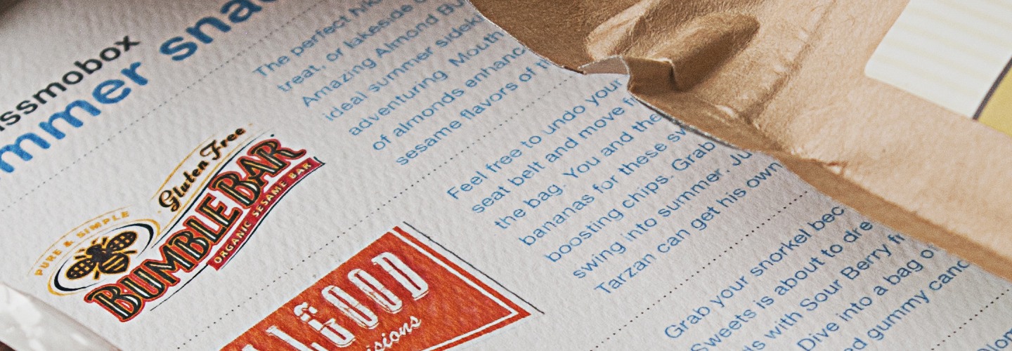
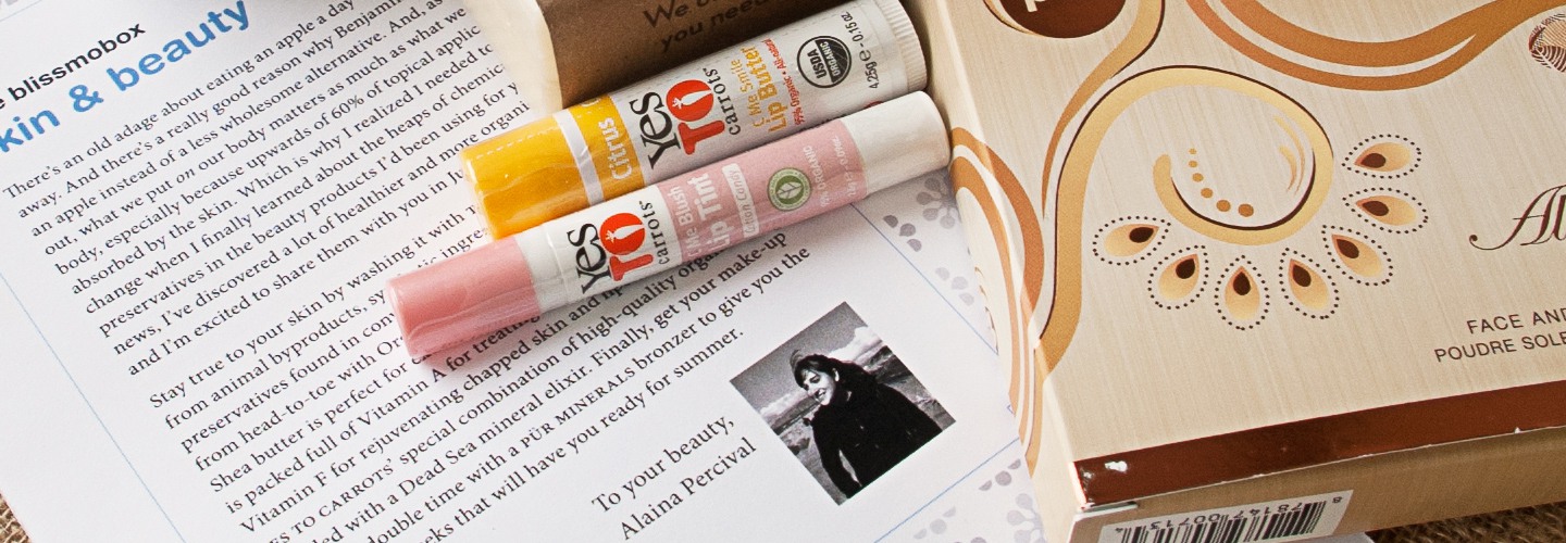
Blissmobox Inserts
You get a blissmobox, but what exactly are these products? Small flyers are inserted into each blissmobox to give a brief explanation on how these products are sustainable, as well as a brief letter from that month's box curator.
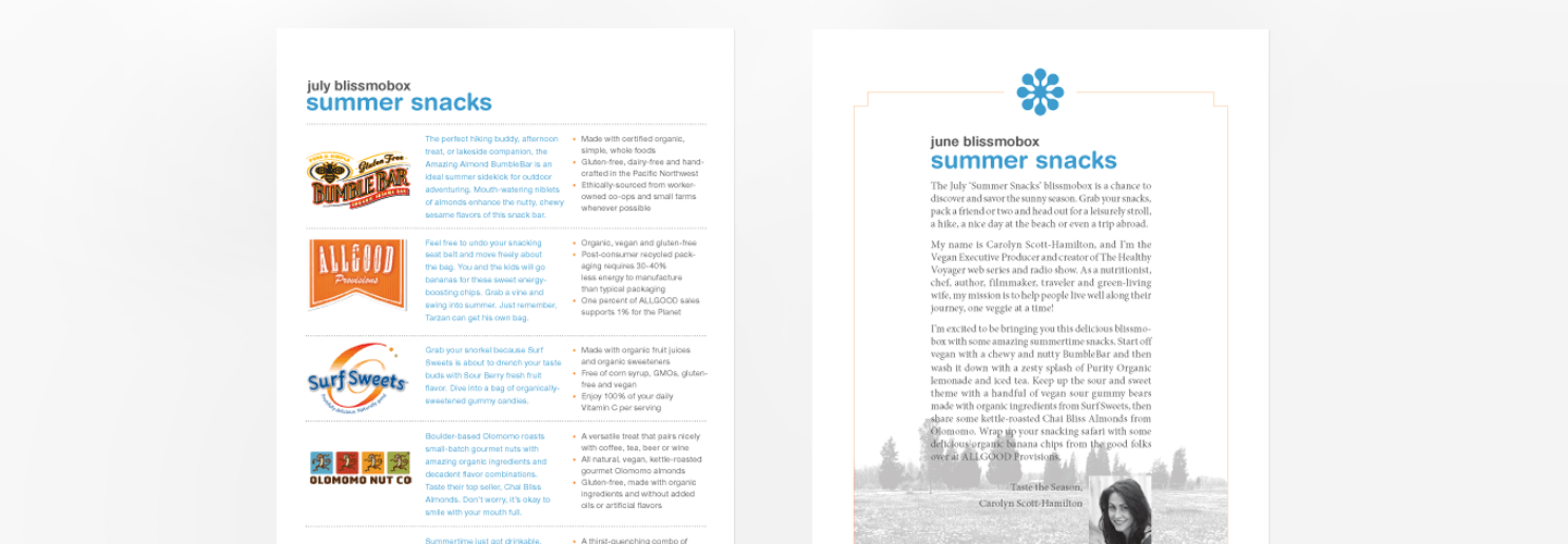
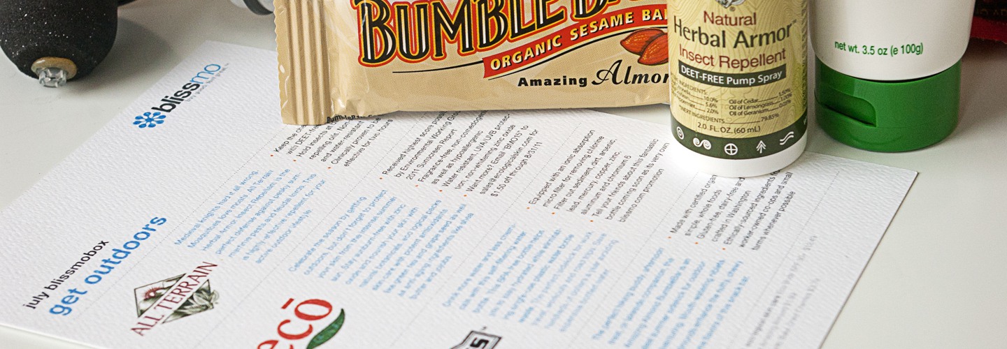
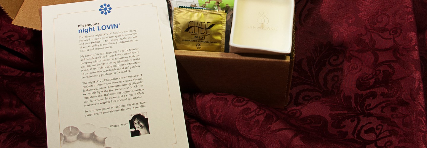
Note: Text and copy on the inserts, courtesy of the blissmo copywriter.
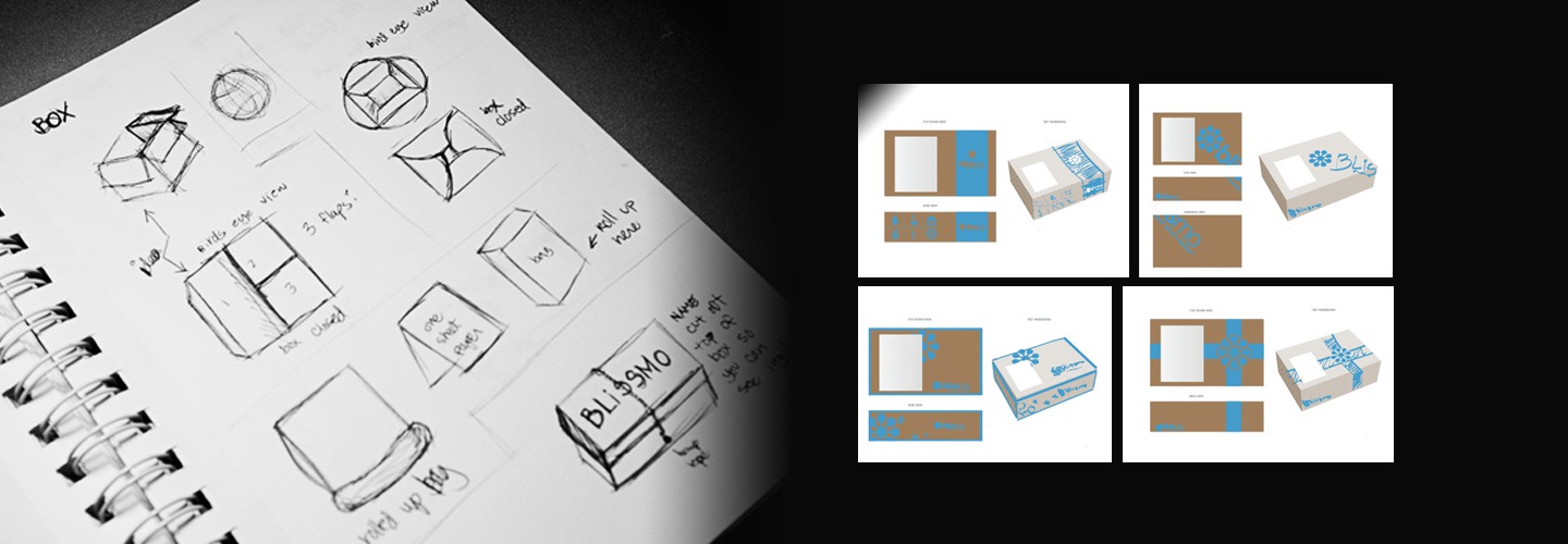
Blissmobox Package Design
Receiving the blissmobox at your doorstep should feel like getting a monthly present. I kept that in mind when designing the box's graphics; Keeping it minimal, but also as elegant as possible within the restriction of one color on a brown cardboard box.
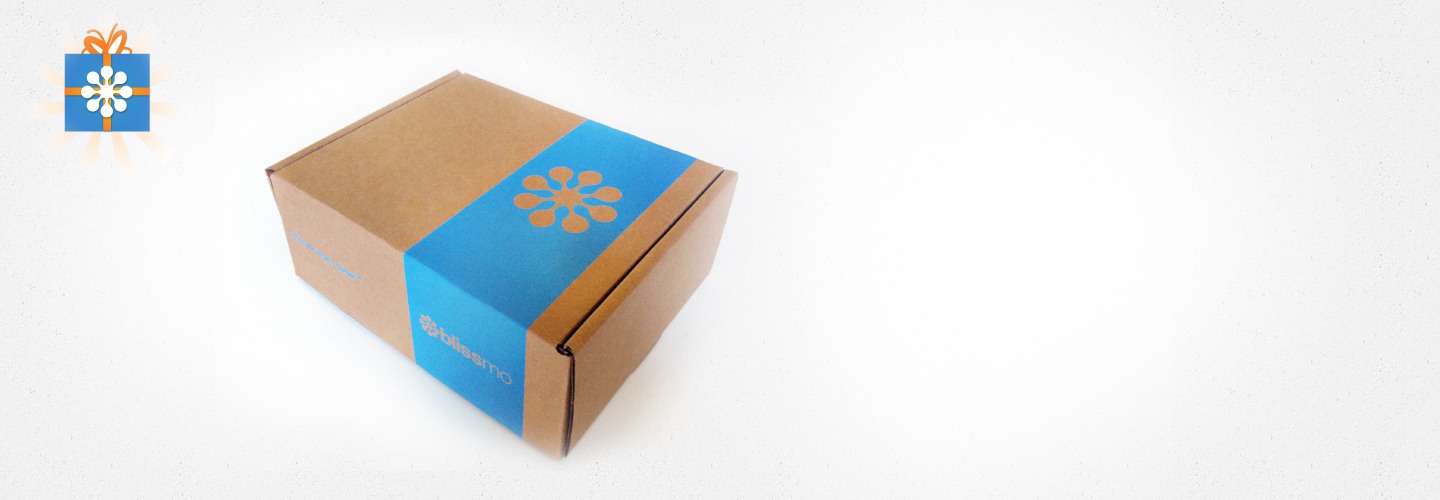
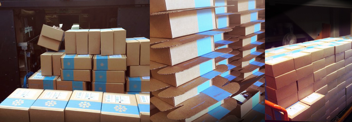
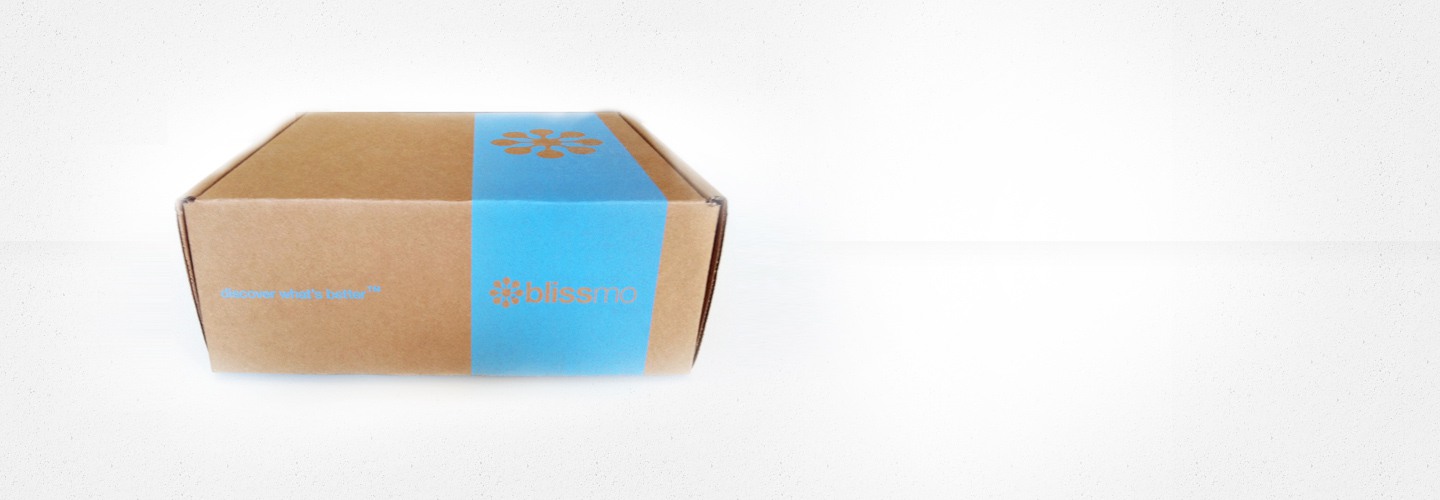
Note: If I recall correctly, 1000+ boxes were shipped to customers every month
Blissmobreak
The idea of the blissmobox later extended to the idea of getting healthier snacks to offices. Why stock your office's snack drawer with fried potato chips when there are better options? That's when the blissmobreak, also known as Breakbox, was created. Like the blissmobox the Breakbox uses a monthly-subscription model, but with less of the surprise element.
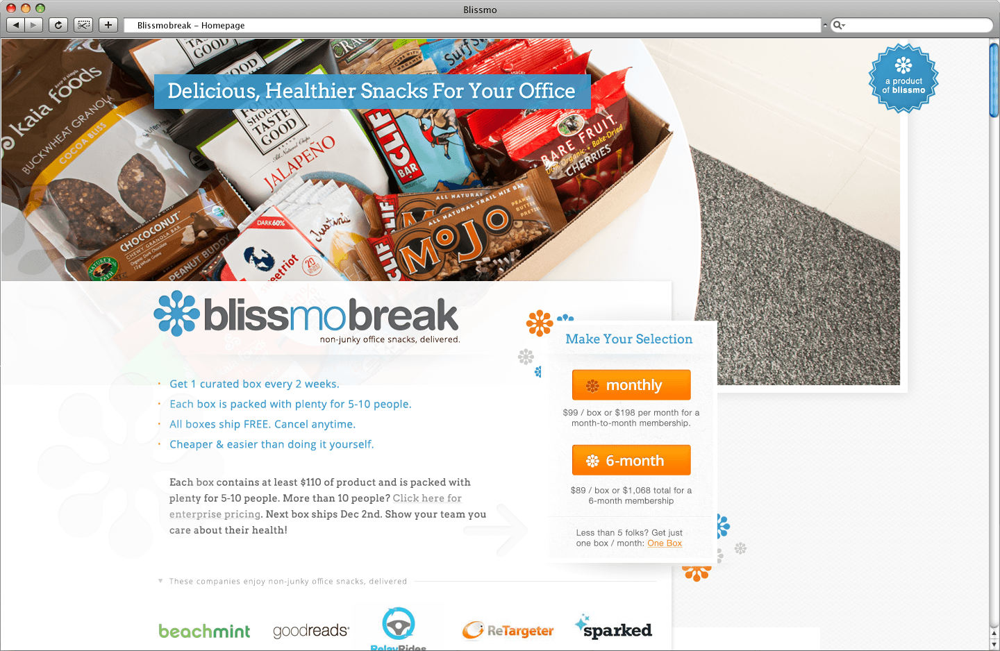
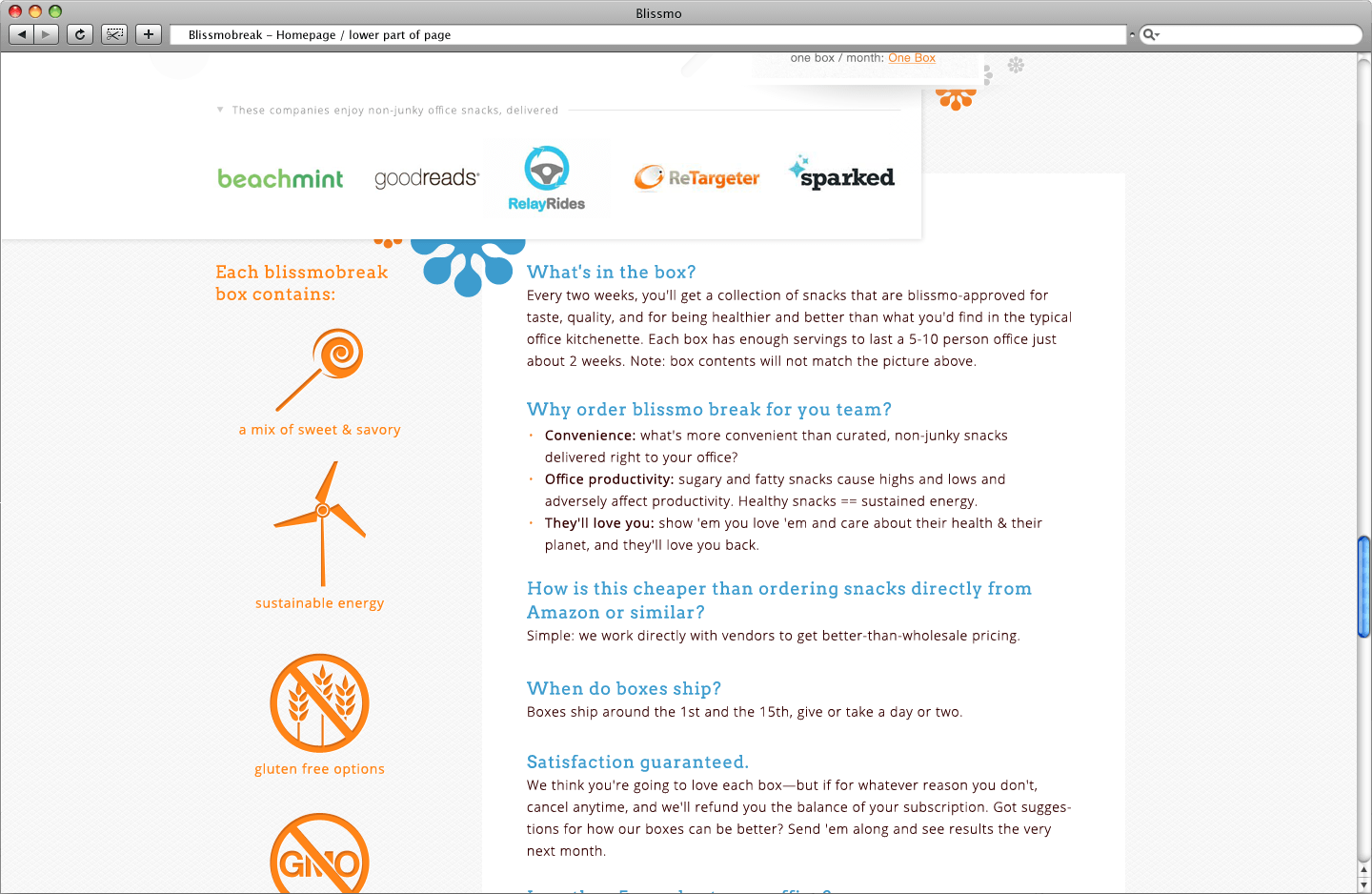
Bigger quantity than the blissmobox, as well as pricing
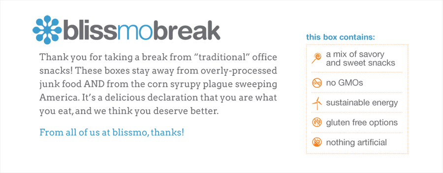
Print Insert / Placed inside the Blissmobreak box
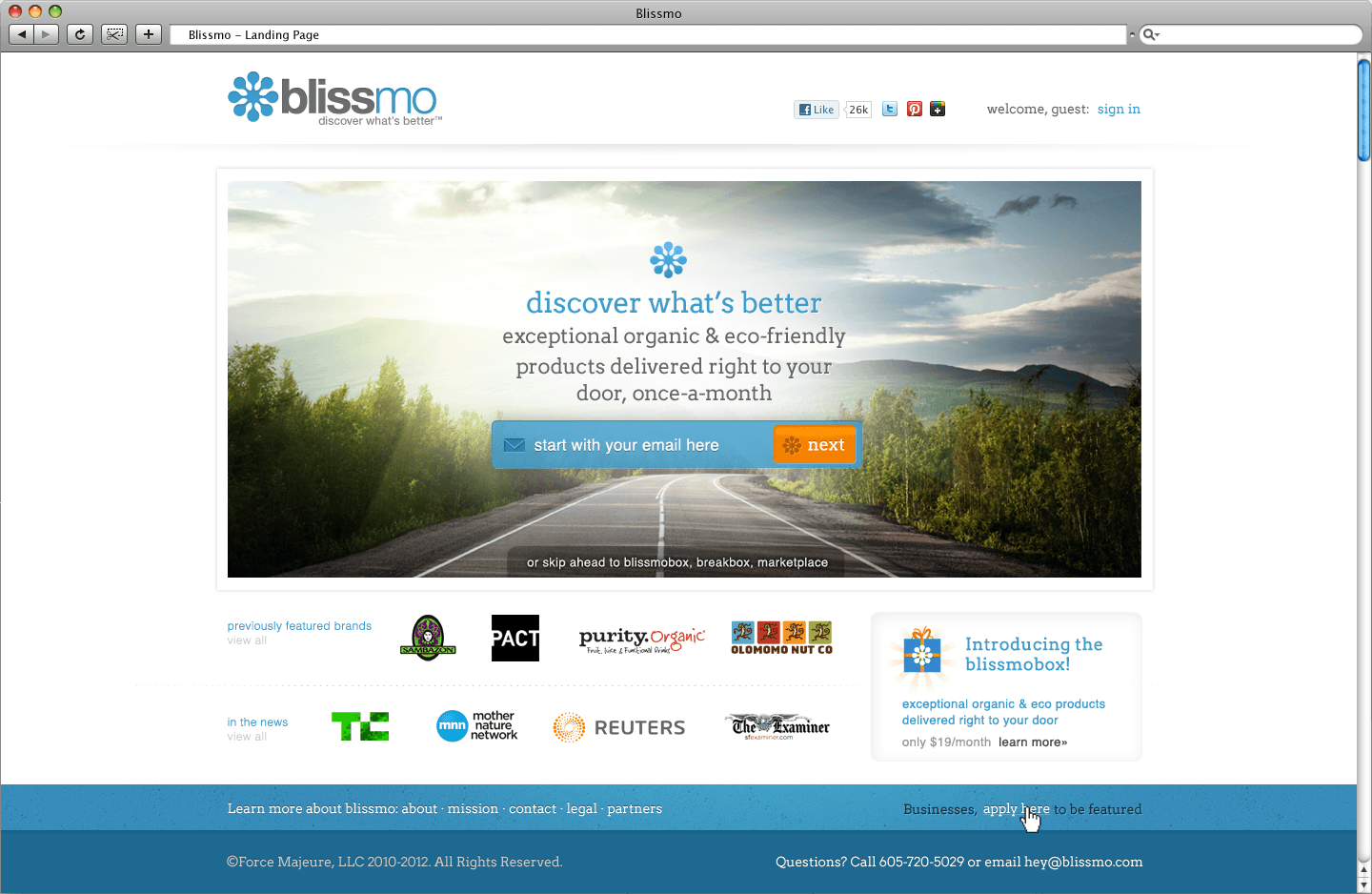
Blissmo Marketplace
An idea that did not come to fruition (yet) was the blissmo marketplace. To go from daily deals, to a monthly subscription model, the next step would be an full e-commerce. An idea similar to fab dot com, the blissmo market would contain timed and discounted deals on eco-friendly products and foods.
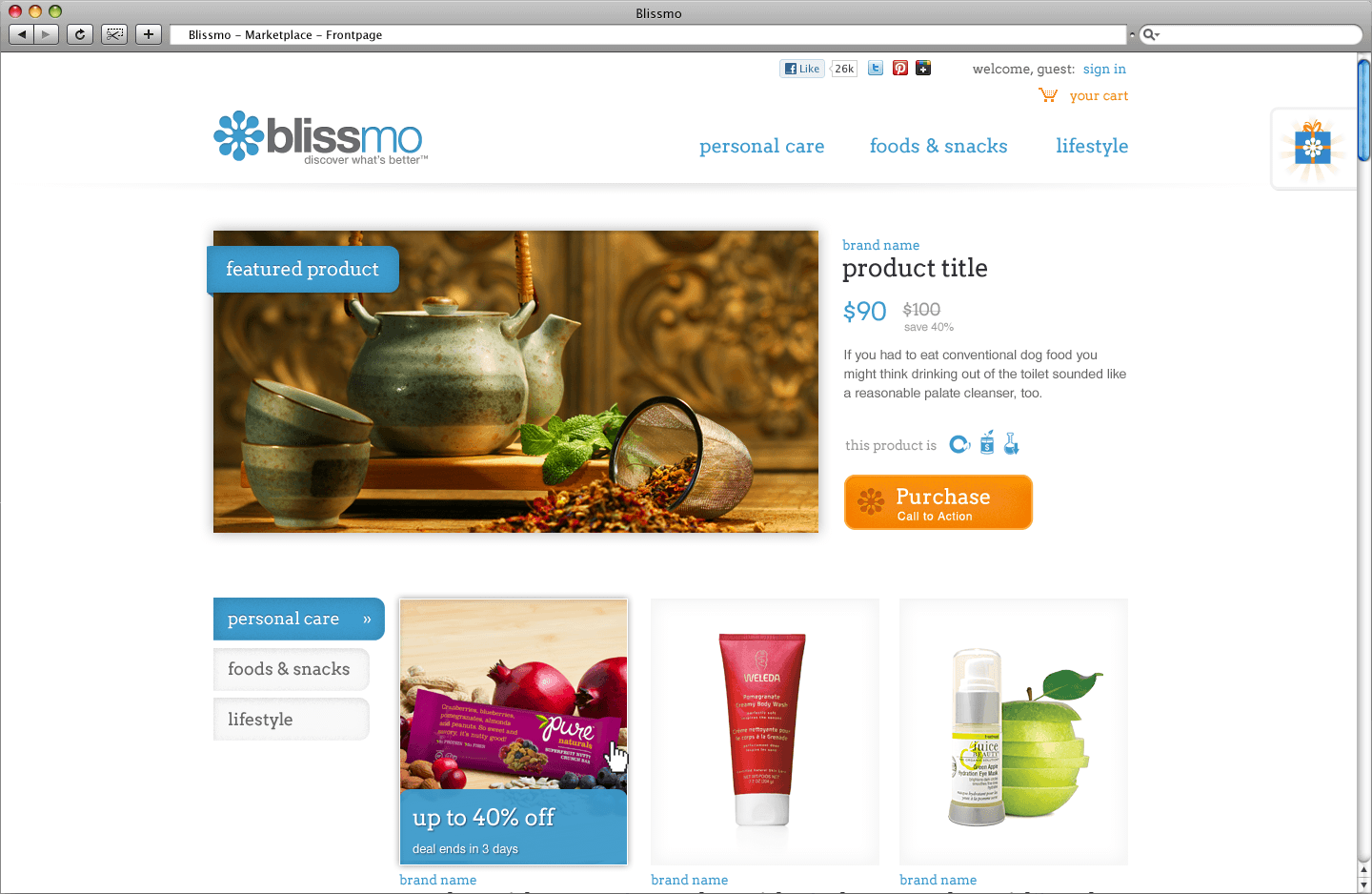
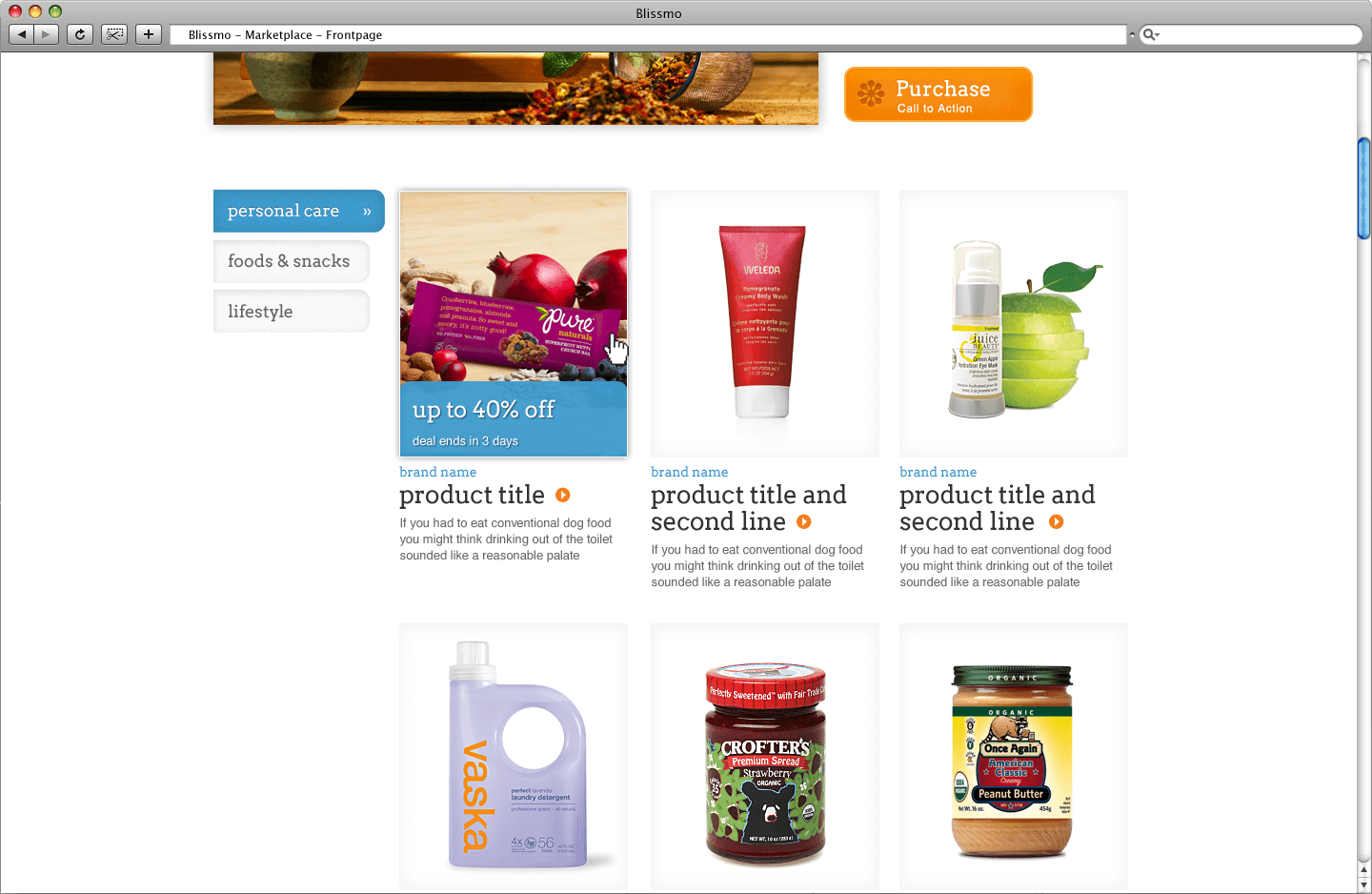
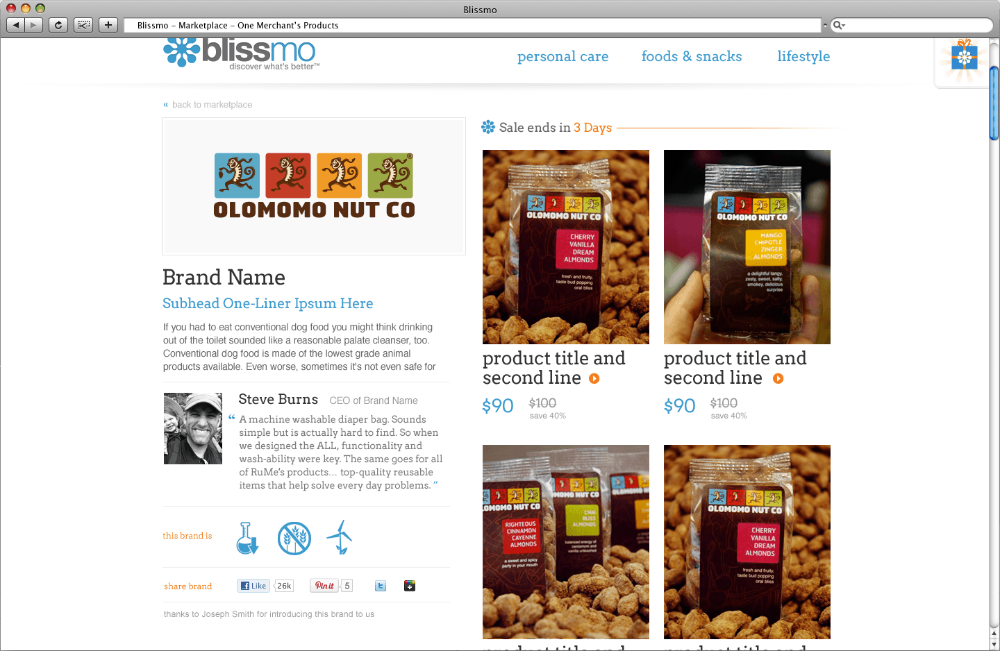
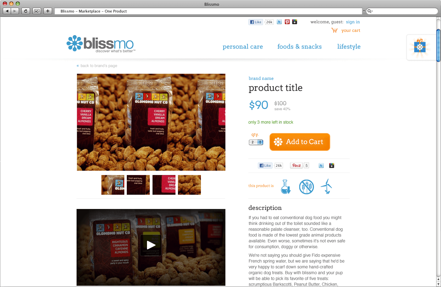
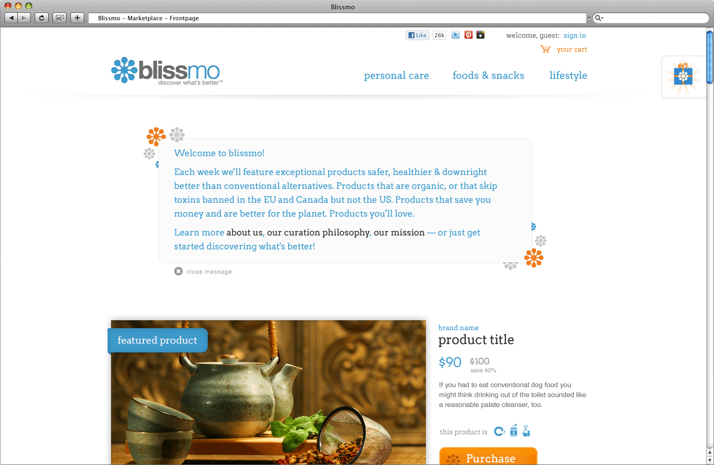
Prototype HTML/CSS Pages
Not having a front-end developer at the company, I had some opportunities to prototype my own designs. Created mostly in early 2012, these designs experimented with jquery plugins and css3. It was not until mid-2012 that I started using responsive layouts. Clicking an image brings you to the html webpage (layout might break in some browsers).
 The Team
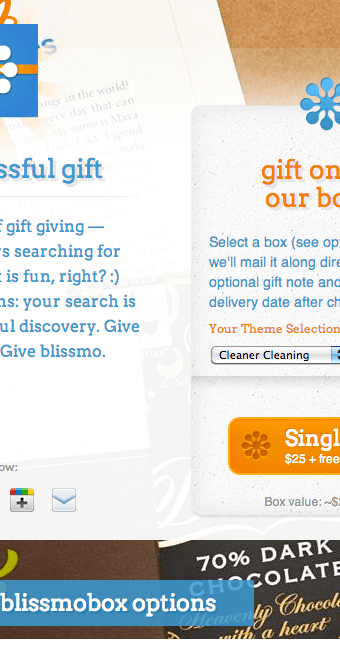 Gift a Box
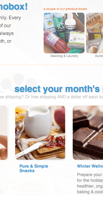 Box Selection
 All Brands
 FAQ
FAQ Merchant
Afterthoughts
I believe that a good brand identity let's the mediums mold the brand, as oppose to forcing a circle-shaped identity into a square-pegged medium. The path I've laid here works in portraying a sense of friendly professionalism without falling into cliches of what eco-friendly branding should be (i.e. the color green and the overused leaf shape). The brand's web and print designs are flexible enough to encompass a good variety of future blissmo projects. Or at least until there is refined target demographic via research & data. In that case, the branding strategy and identity will need some revisions.