Flagpoll
Software for lobby group to collect feedback from state officials from every county in the state on legislation. In a broader perspective, an easier way for admins to manage and distribute content to and from their users. I worked with the PM, devs, and prospective customers of this product concept to get out the best initial product that could be.

Why create this product?
At Coshx Labs, we had a biz eng named Cass. She also worked on a special committee in the State of Virginia. As a state official, she was in touch with the state’s lobbying group, Virginia Association of Counties (VACo). VACo wanted her opinions and feedback on bills and issues that were going to be, about to be, or currently being presented to the State’s legislature. VACo's involvement with a proposed state bill looks something like this:
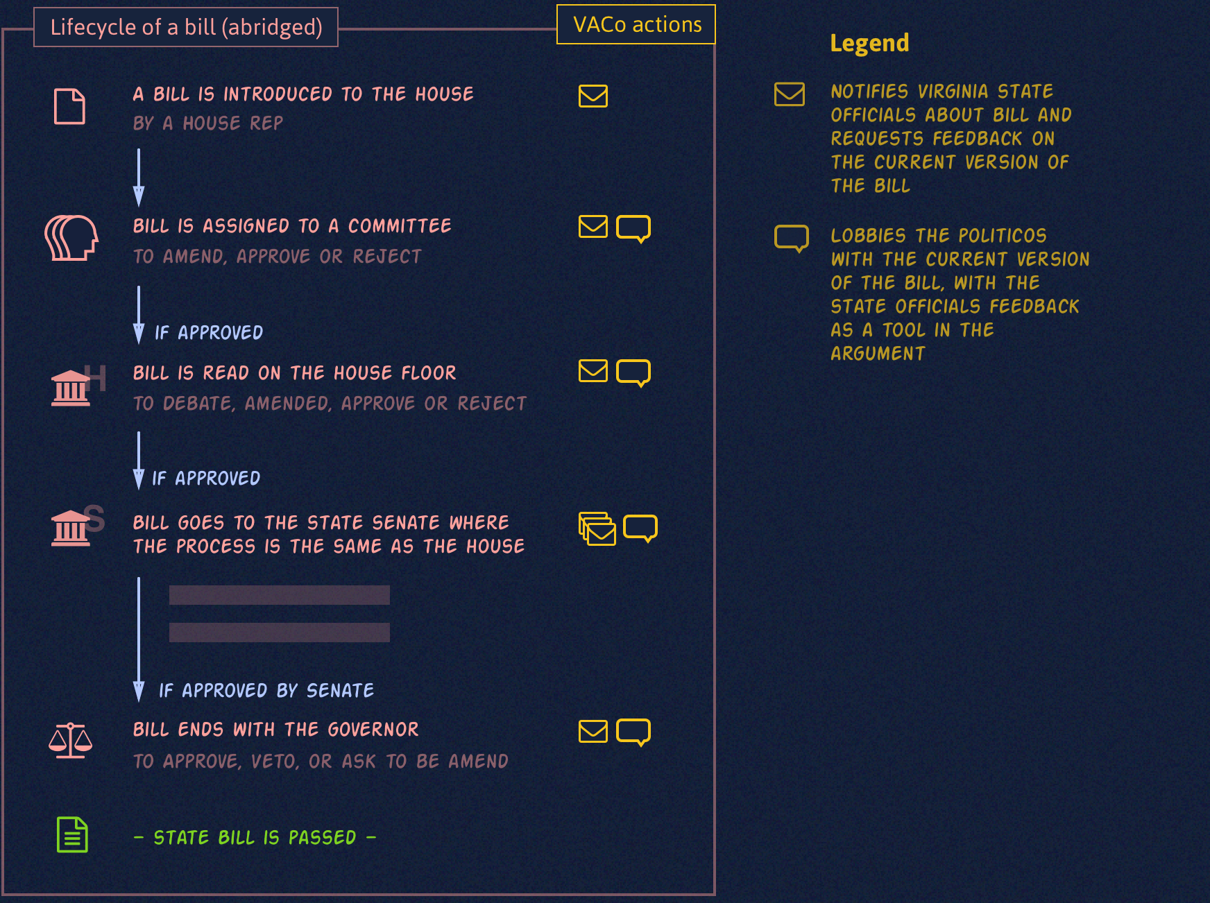
The Virginia General Assembly goes through about one hundred proposed bills annually. For Cass, that means VACo contacts her, mostly by email, to get her take on each iteration of each bill. That adds up to a good amount of email per week. People get enough emails as it is already. Add on top of that getting frequent emails about each proposed bill and its many updates consistently over a timeframe, and you will get people ignoring these emails.
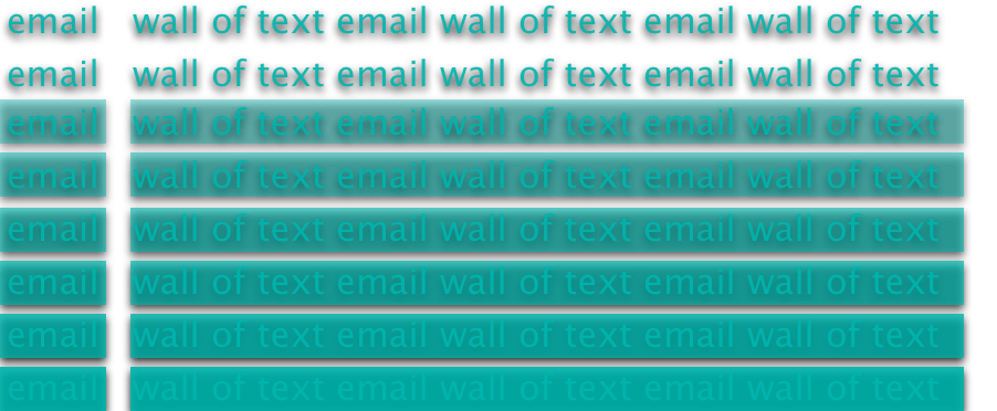
On the other hand, VACo wants to collect feedback from as many state officials as possible on each version of the bills that VACo has identified as important to some/all Virginia counties. Feedback is vital for VACo, as the feedback is cited as evidence when lobbying special committee members, house delegates, and senators on the details of a proposed bill. With 95 counties and 5-10+ state officials in each one, managing email feedback for all the bills is a heavy task:
What does VACo lobby for? It exists to support county officials and to effectively represent, promote and protect the interests of counties to better serve the people of Virginia.

Cass—being a state official herself—became self-aware of these pain points that exist in the feedback interaction between VACo (admin) and the state officials (users). With her connections to VACo leadership, she brought up the idea for a software solution to alleviate these problems while at a VACo conference. Armed with a napkin sketch, the idea generated enough interest to pursue a minimal viable product (MVP) for this idea tentatively named “Flagpoll.”
Road to Success
This being an internal side project inside the company, we needed to commit design and dev resources wisely. We knew we could not address or solve every technical problem immediately, but we wanted to be sure that what users could do upfront in this product was useful, as well as have customers willing to pay some money to keep servers and databases running.
The plan: have VACo jump onboard as the first admins and users—they have a large user base (Virginia state officials), a workflow problem we feel can be solved with this product, as well as the budget to support the bandwidth. Most importantly, we have direct access to the VACo leadership for feedback on product iteration. The milestones in the roadmap begins with a walk-through of the interfaces design, then a demo of a working prototype, and later on getting state officials to use the product at some capacity in their day-to-day.
Designing for admins
From interview sessions with VACo leaders to strategizing and collaborating with Cass and team, we were able to identify the problems to solve in the admin workflow. Here are a few key factors:
Too easy to lose track of bills and their many updated versions
With the volume of bills, a better way to triage them is valuable, as VACo currently keeps track of their positions on bills with internal word documents and spreadsheets.Finding and selecting desired data on bills is tedious
As noted in the diagrams in the previous sections, searching through individual emails for specific state official feedback is tedious and time-consuming.Two types of users were defined at this point for Flagpoll: admins and users. Admins are the VACo leaders who input bills & issues into the Flagpoll database. Users are the state officials who leave feedback on each bill. The following sections show some of the ways that Flagpoll is designed to address these admin concerns, as well as creating better workflows.
Admin overview
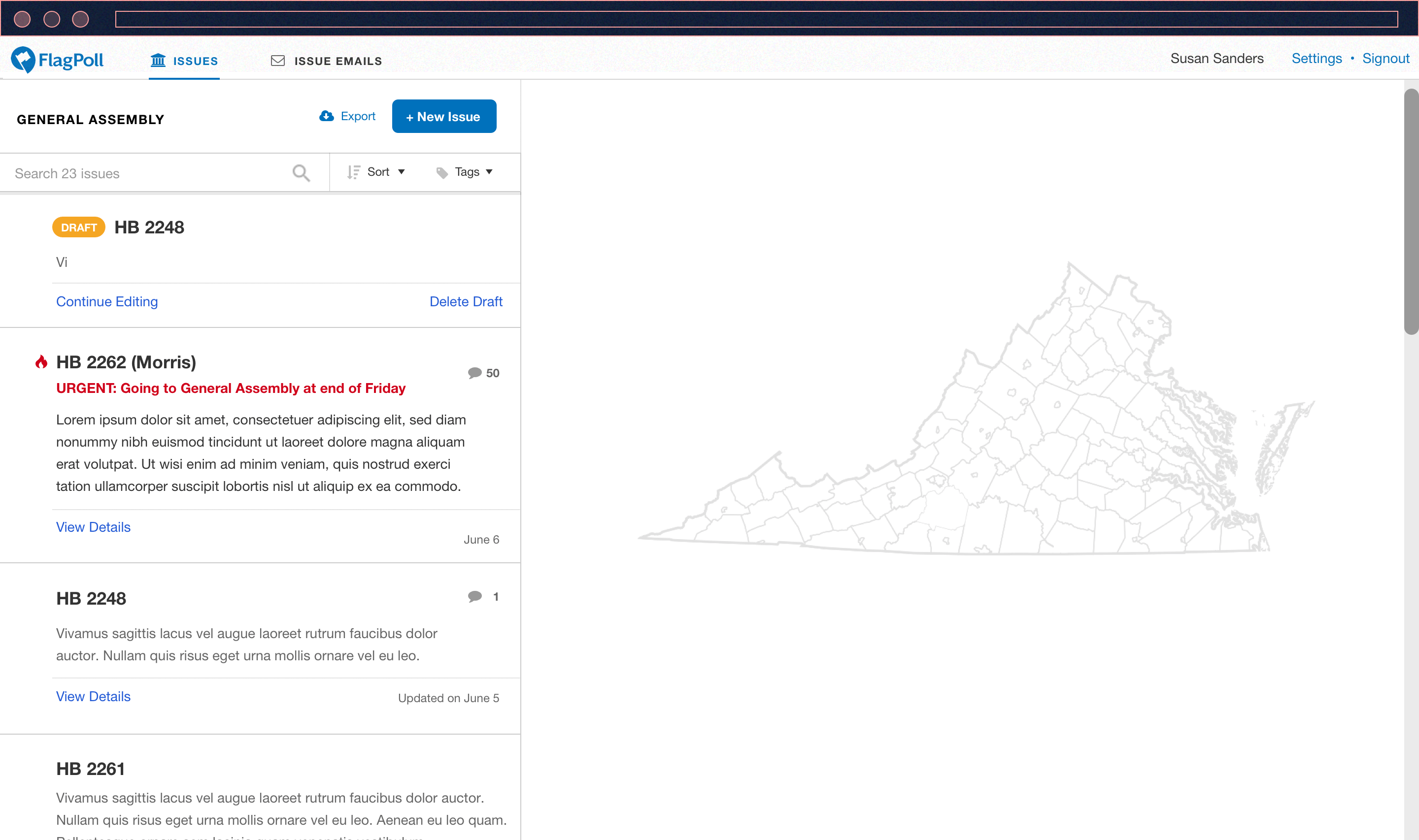
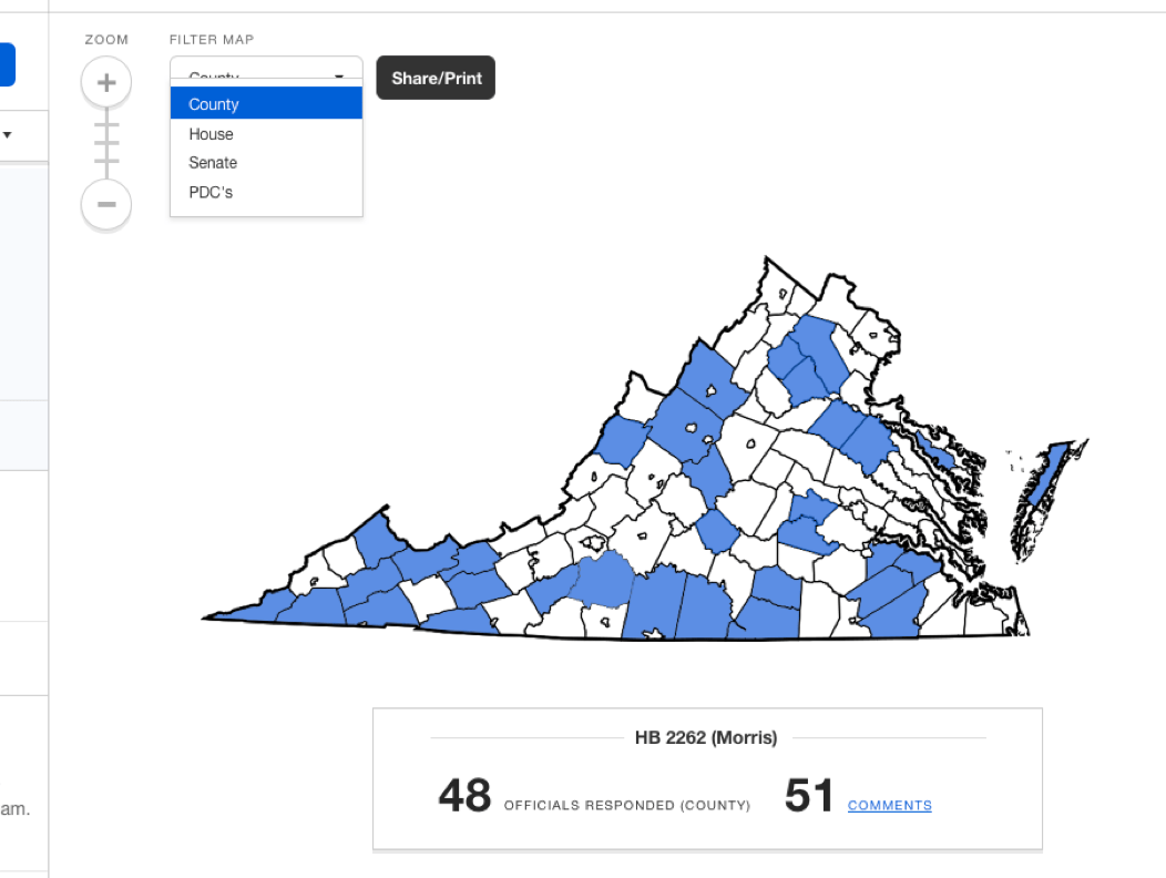
When the General Assembly is in session, the “get feedback from state officials” workflow for the admins amounts to a lot of tasks—from collecting feedback, analyzing feedback, monitoring bill statuses, to notifying people to leave feedback. Flagpoll is designed so that when the admin logs in, they are situated to focus on the latest bill activities between VACo and the state officials.
Inputting a bill into Flagpoll
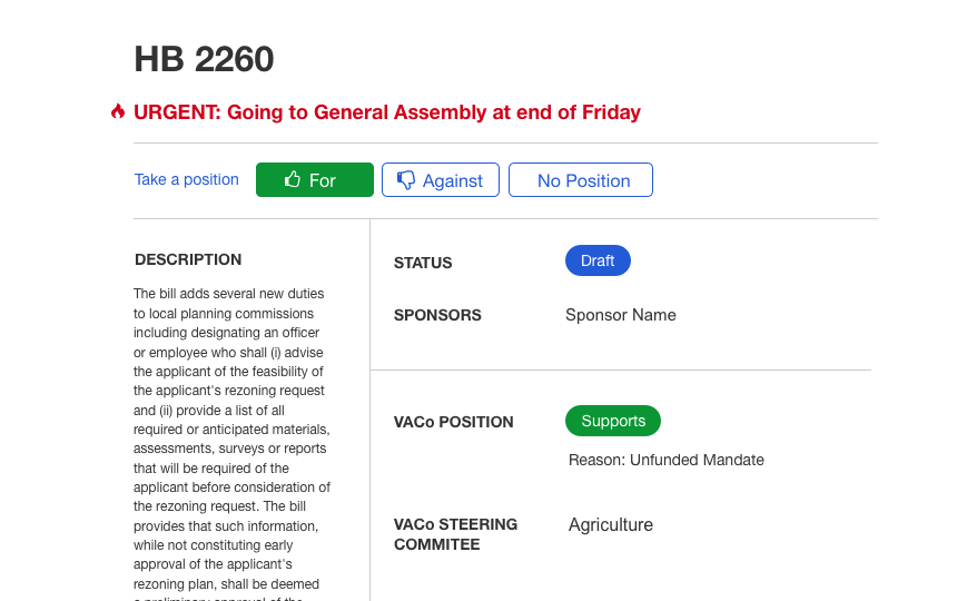
The details in a bill can be many pages long. A government website database already exists with full details on these bills. In Flagpoll, admins only input the key information that gives users guidance, talking points of the problem, and who to contact.
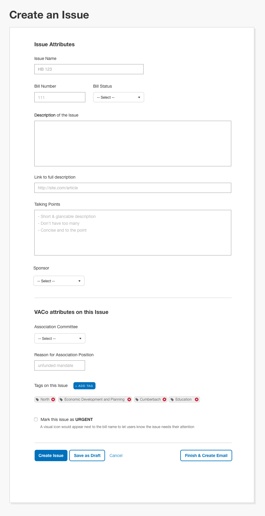
From our understanding, there are times where VACo admins want feedback other than for legislative bills from Virginia’s state officials. For example, admins may want feedback on internal organizational processes and issues.
Inputting and modifying each bill iteration into the Flagpoll system is definitely not ideal. In a more ideal world, the bills would auto-generate into Flagpoll from a government database, but building that out is not worth doing at this stage of the product’s development.
View of a Bill
In Flagpoll, a bill contains three sections of information: details, past history of the bill, and most importantly—feedback left by users (state officials).
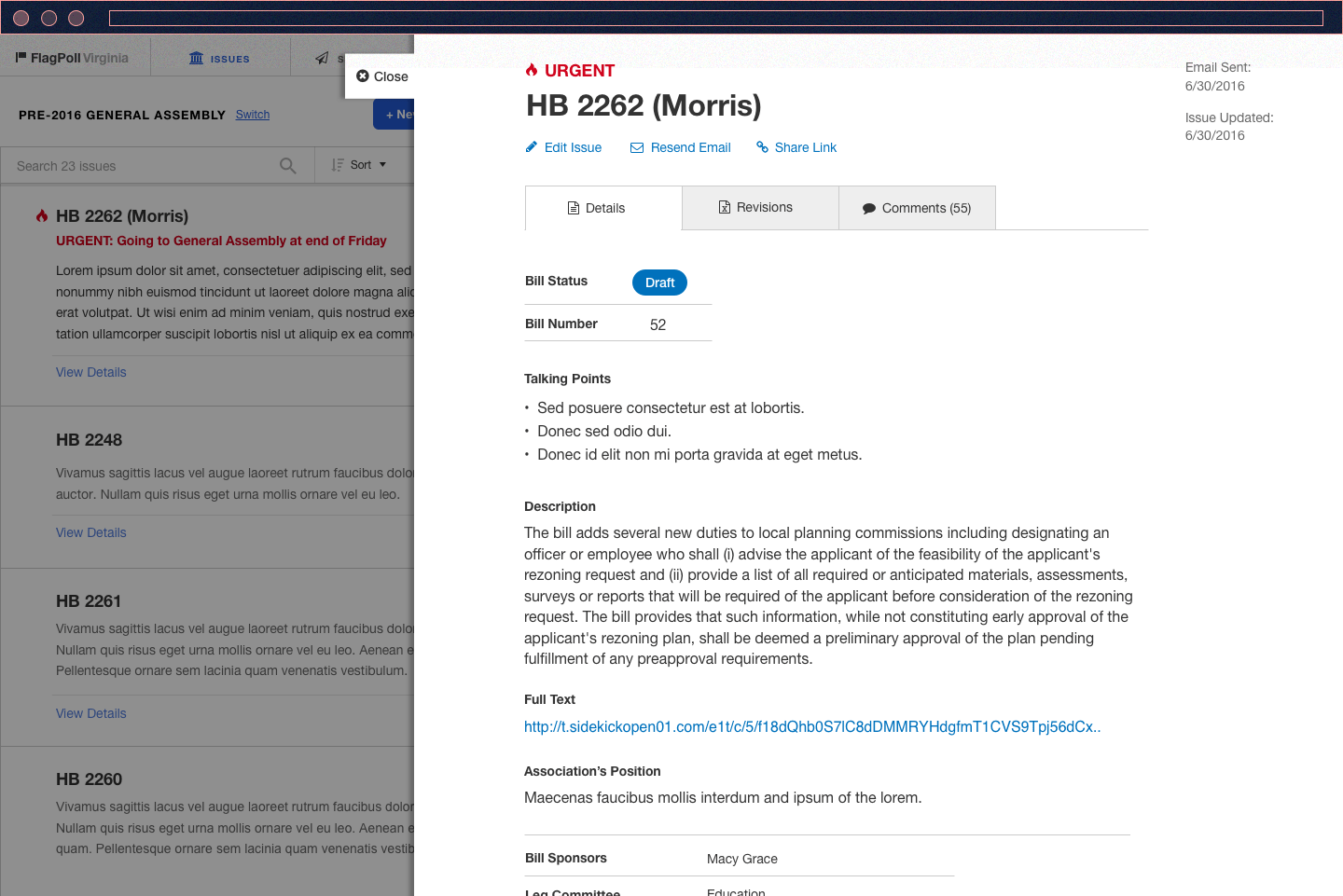
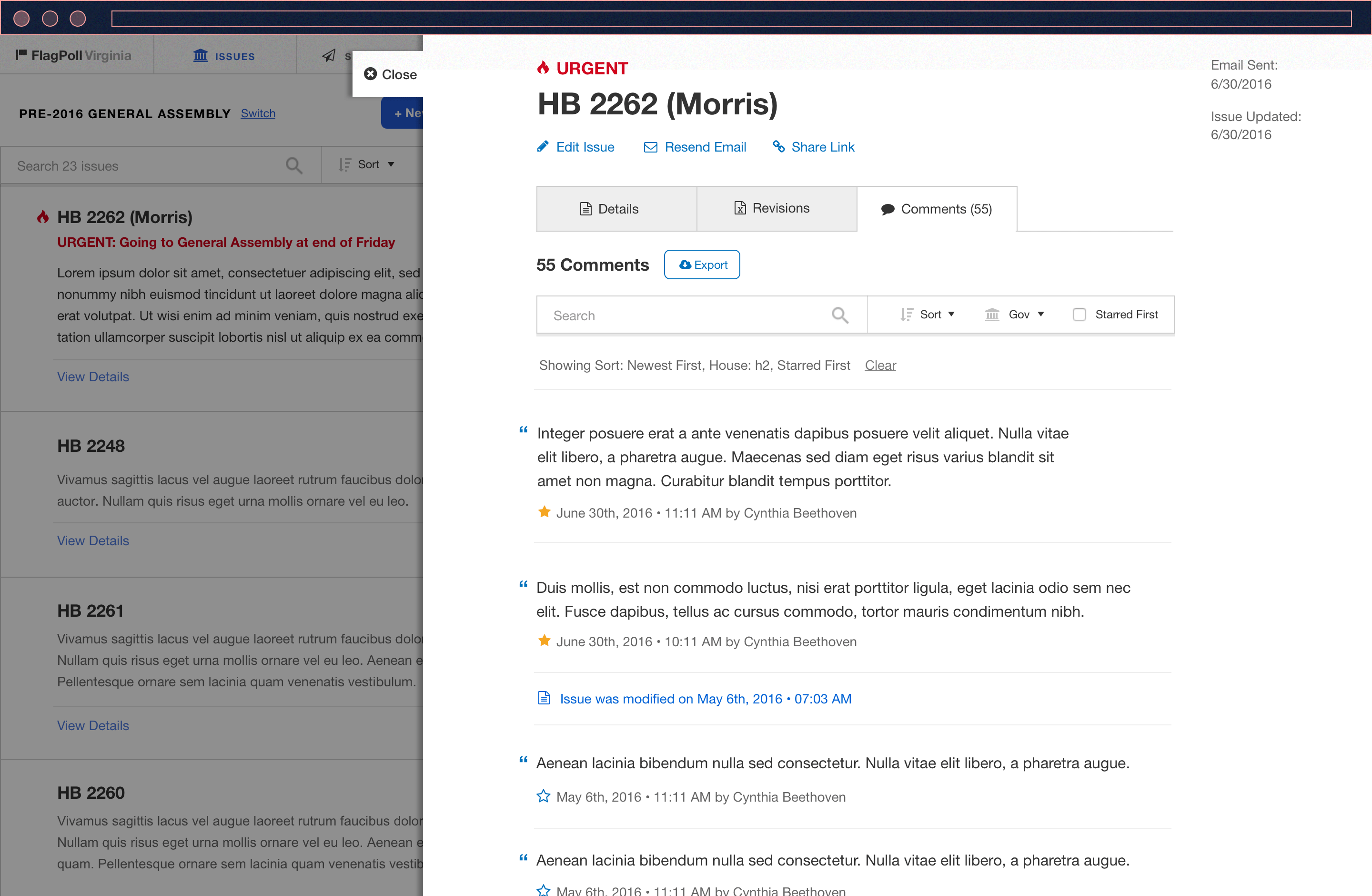
Get a sense of the admin workflow click around an early UI prototype:
https://invis.io/TWAC62AJB
Interface and interaction decisions
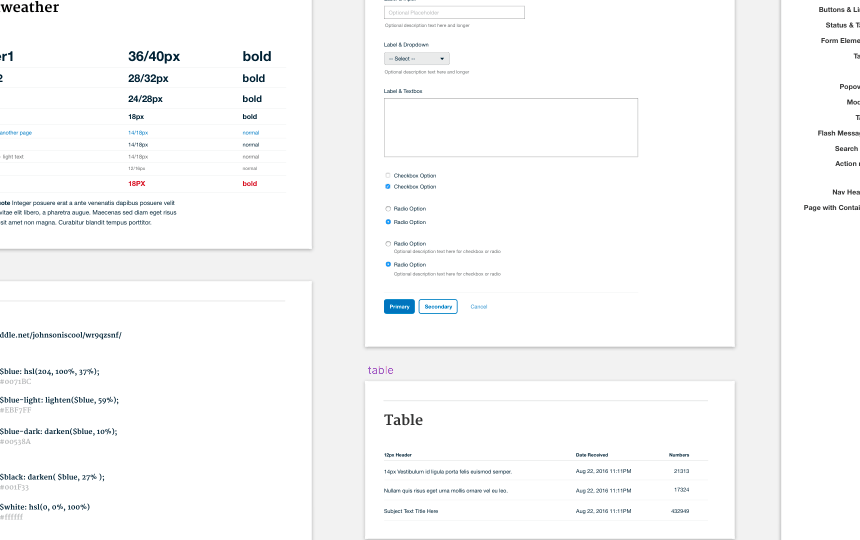
In today’s web, there are many tried-and-true design patterns to solve & convey any single user interface interaction. In the images and prototype in the previous sections, you may have noticed the following:
Obstacles designing for the admin
With the initial designs comes some uncertainty for the path forward. Some of obstacles may be technical constraint and other times product ideas that make the MVP less refined and harder to achieve.
Graphical Heat Map
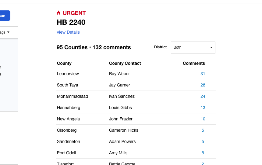
The heatmap was validated as a good feature to have. Not only is it very helpful, but it also adds a bit of “eye candy” to contrast the heavy amount of textual content. However, the development of such a feature is resource intensive. The decision was made to have a simpler table of data developed first for the initial product, with the heatmap to be worked on at a more leisurely pace.Email workflow
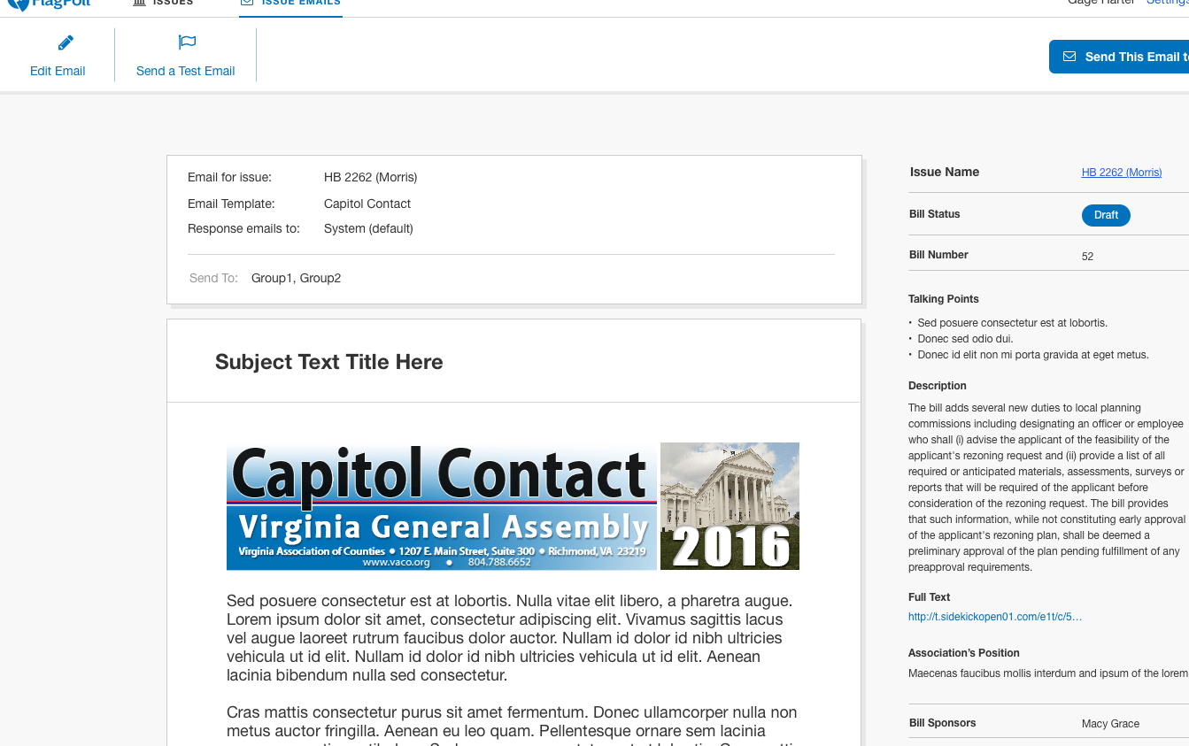
This workflow is key to the admin to reach their users. VACo could continue using their email app alongside Flagpoll, but it would be redundant in task. However, to have email functionality inside the Flagpoll app is not only a huge commitment in dev resources, but also steps into the lane of established companies such as MailChimp and Campaign Monitor. We decided it was better to create minimal design iterations on a simple emailing function and do more research and validation on the concept after initial the product features are set.The Flagpoll designs for the admin workflows and scenarios are straightforward. Technological limits at the moment may be holding back some functions and user experiences, but what Flagpoll does have now is a flexible start to the product, in the event that product features and concepts need to pivot. The next part of this case study will go into Flagpoll addressing how the state county officials (users) interact with VACo (admins).
Designing for users
As mentioned earlier, Cass was a state official of Virginia who saw an opportunity to optimize the interactions between VACo and the state officials.
Her insights as a state official guided and advocated for what was needed for users in the Flagpoll app. On the flipside, VACo wanted specific data from users in specific scenarios. With these two POVs, as well as insight from a few other state officials, we narrowed down the main things to solve for users:
Get their bill feedback within the context of their day
Users got a lot of things going on during their day. Not all of them can set aside time to invest in leaving long feedback on bills frequently.Encourage them to view other bills & issues
Different counties care more about certain bills than others, especially with the amount of bills and bill iterations that exist. Finding ways to let a user learn about other bills would help the State of Virginia in the long run.Toe the line between sending heavy content and spamming them
It may be unavoidable sometimes to have a whole bunch of information dumped onto the user. We need to figure out how to have less of an information overload for the users.From our understanding of this political domain and the workflows that it entails, we identified different types of users. The notable group is the older generation of politicos, whose computer interactions consist of word-processing and email, and lack more modern web experiences. While we can’t design the whole Flagpoll experience optimized for just these users, we made sure to make it accessible to them, as well as made a point to make sure the design and interactions are clear as intended. With that said, let's look at the Flagpoll designs:
Personas were not used The timeframe and stage of this project did not make using them ideal, as I do not believe in defining indepth personas for early stage products. User descriptions and other concepts like user stories/job-based user stories worked quicker to validate this iteration of the designs.
Responding to VACo emails
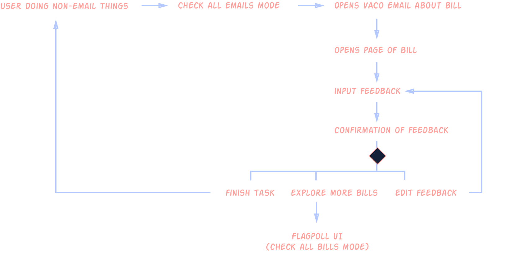
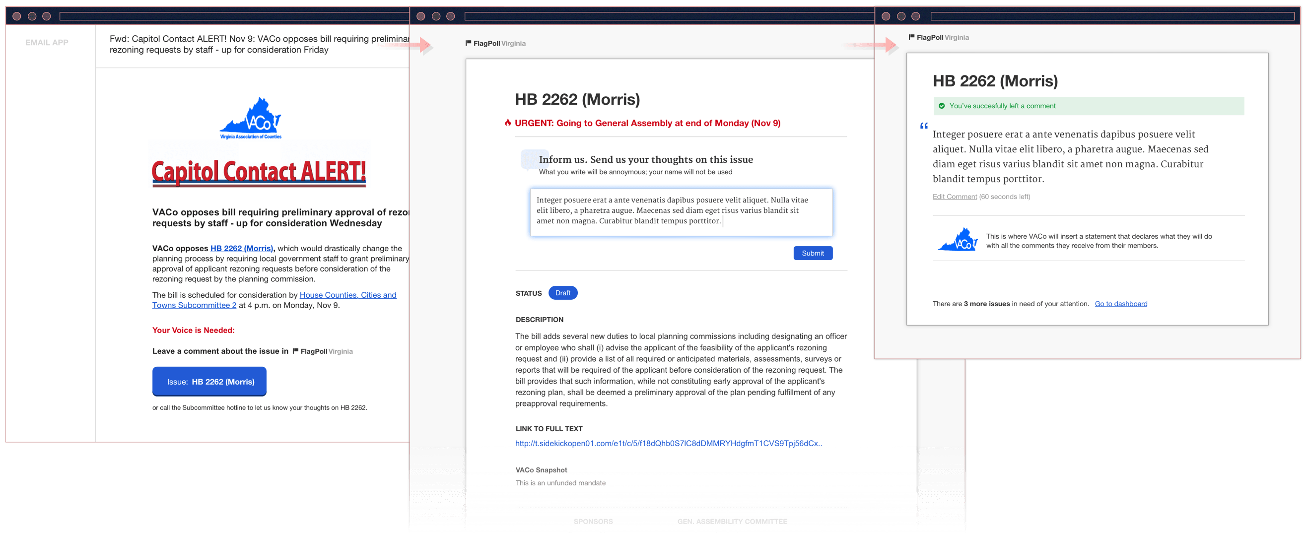
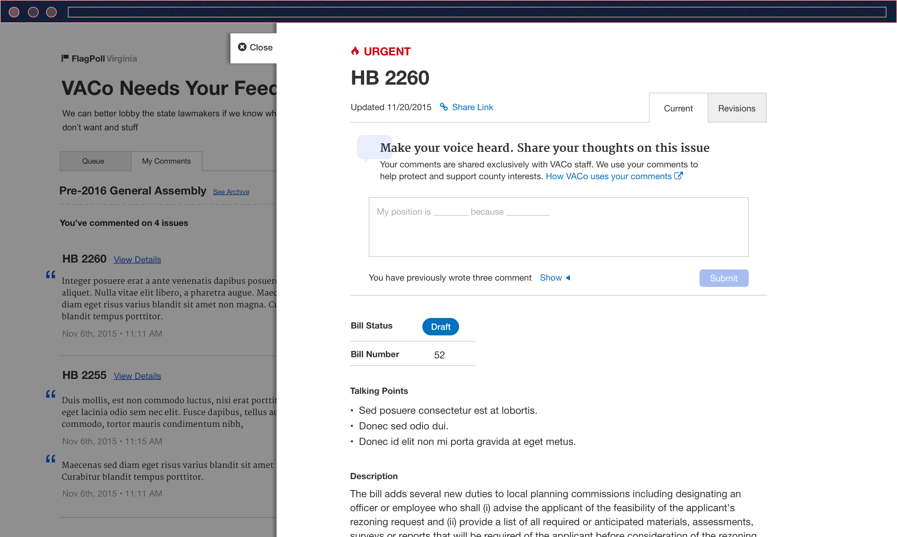
In the VACo email that users get, the url link to leave feedback brings them to a one-pager about the bill at hand. Once feedback is submitted, they see a confirmation for their input and can then go back to the rest of their day.
Overview
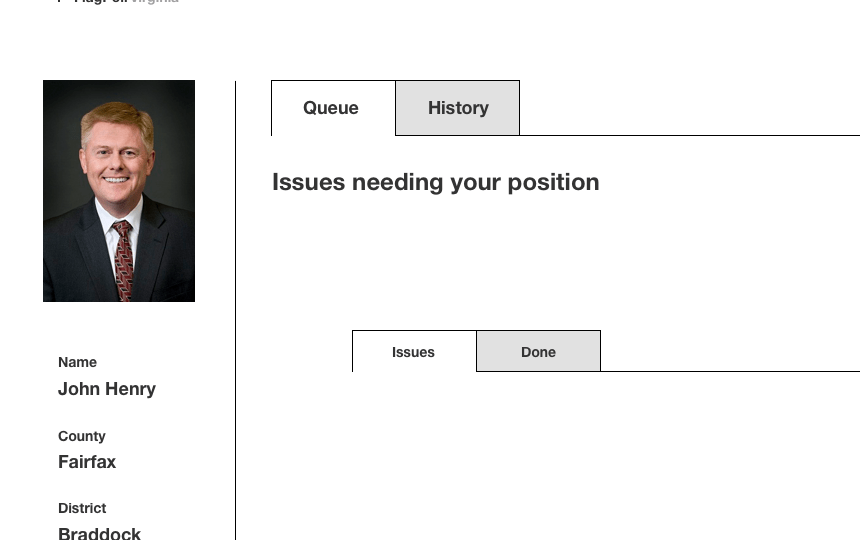
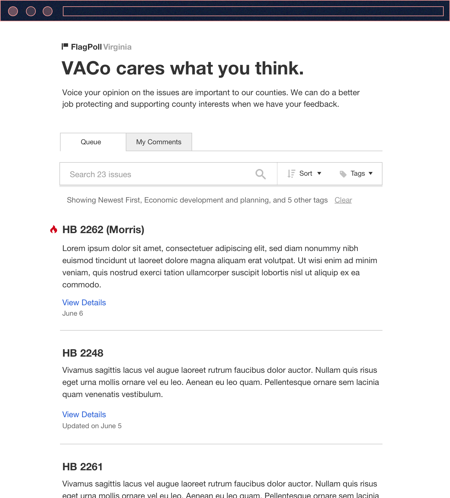
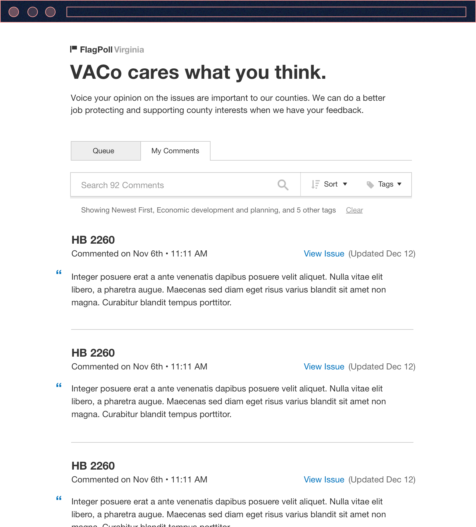
When users log into Flagpoll, the first thing they see is a list of bills and issues, sorted by most recent,as well as the bills’ relevancy to them.
Get a sense of the user workflows, click around an early UI prototype:
1) Email flow
2) User UI
Interface and interaction decisions
The design patterns for the users are the same as for the admins. One important thing to note is that the user's list of bills and issues are filtered by default to things that are relevant to their state role or geo-location in the state (e.g. bills that affect rural counties vs cities).
Obstacles designing for users
Users were a bit more ambiguous to design for. The admins were a group of less than ten people, while the users were over 100+, not to mention more varied in roles, ranks, and scenarios.
Assumptions of users
There were a lot of assumptions on all types of scenarios the users will encounter around bills and Flagpoll. For example, how users should leave feedback. We ended up with an open-ended input textbox when originally the idea for users to declare if they are "for or against" a bill was thrown around. We made sure to identify and keep a log of all the product/user assumptions beforehand and weigh them through different criteria to decide the proper (in)actions.Too much excitement, possible scope creep
The more we immersed ourselves into the concept of state legislation and the users, the more product ideas we felt adamant about. For example, a feature was proposed for the initial product to allow users to bookmark/favorite a bill and follow it all the way through to the end. While it would immerse the user, there were a few problems: 1) scope creep 2) it alters the original product from quick n' go to something quite different 3) an under-researched and untested concept should not be rushed into. We ended up putting the concept into the backlogs for now, even though we all think it's a great idea.Getting Virginia state data
A few of the smoother user experience flows relied on the technological ability to access certain information, such as a database of all state officials to get their names, emails, counties, and other metadata. We also had to make sure to cover our bases and design back-up ways for users to still complete their tasks in Flagpoll.One of the milestones for this product was to have the Flagpoll designs for both admins and users demo'd to the VACo leaders via a big group video meeting; The prototypes above were shared, insight was gathered, and questions were asked and answered. With all that approved by VACo, the next step on the roadmap was to build a working prototype.
Development + Design collaboration
There were two devs and an Agile method scrum master working on Flagpoll. The dev workflow was structured into weekly sprints, with me unblocking their paths if the interface design needed reworking, user experience conundrums arose, or any other unanticipated problems.
For devs, UX is not their main focus so sometimes they may overlook some of the finer details in the interface. For the small and trivial things, I can jump into the CSS and fix it myself. For more major bugs, it's best not to hassle the devs immediately, but to wait for them to accrue just enough for the devs to tackle them all at once.
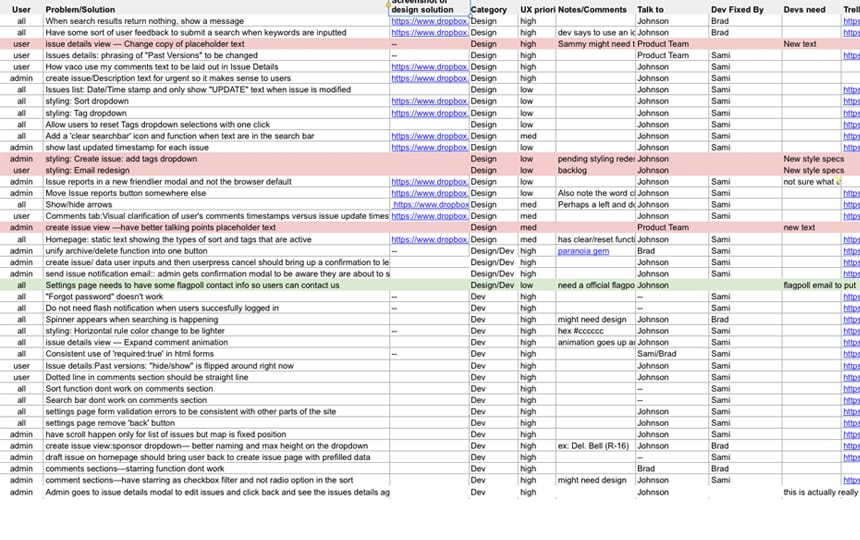
Luckily, the Flagpoll devs were great people I worked with in-person at the office. I scheduled a few group sessions over the dev period to walk through together the working prototype full of dummy data through the lenses of admins and users. If I saw something wrong, I had the devs talk about what was going on before I went through my explanation on why this was a bug or why it was imperative that it was fixed. I itemized each bug in a spreadsheet, then later ranked each one on the priority of "user experience problem." The devs would in turn rank them in terms of "scope to fix said bug" and then work through the spreadsheet.
Going Forward
We got the development going at a good rate over a few months and was able to reach the checkpoint of demoing a working prototype to the VACo leaders. The devs led the presentation and by the end of it, VACo was ready to start this partnership formally in regards to more detailed written agreements.
We reach our milestones within the timeframe we anticipated. There was still work to be done such as considering a whole compose email feature, which I explored a bit, and the devs were figuring out how best to pull state officials' credentials and data into Flagpoll. By the end of my time at Coshx, Flagpoll had broken off into a separate entity from the company, headed by Cass.

