Configuring Server Monitoring Alarms with Rackspace
A technical computing function that previously required users to understand a coding script was redesigned to work as a web interface interaction that required little knowledge of the code and was more encouraging to novice users.


Do you have a website or web app you need to be on the internet? Rackspace can help you with that. They can host your site/app on their servers for a monthly fee, as Rackspace has servers—a lot of them. In fact, they have a whole suite of I.T. products to run your internet operation, whether it be a blog or a streaming video site.
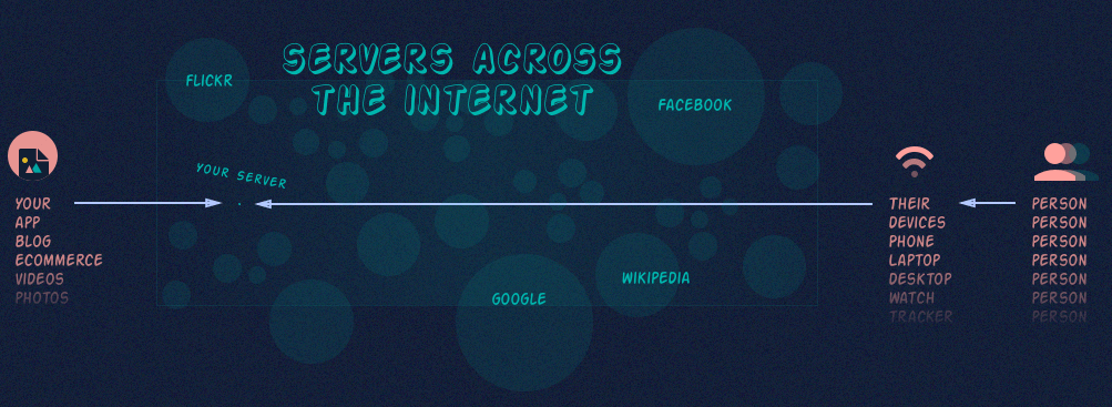
You can think of a server as a physical machine that runs your site or app. This machine is similar to your personal laptop, as it has a CPU, RAM, hard drive, etc. Every time someone visits your site or app, the server’s resources (CPU, RAM, etc.) are used. If your site/app is highly trafficked by people, then you may need multiple servers, as well as ways to manage your servers. If your server is overloaded, it will crash, which means your users cannot see or use your site/app.
Monitoring your servers

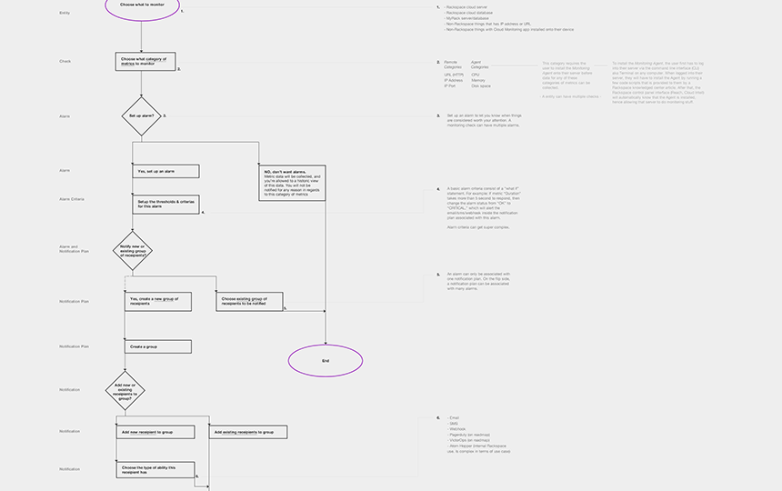
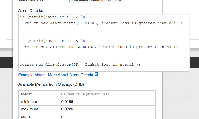
You don’t want your server to ever crash, as it will stop your visitors from being able to use your app or buy the things you are selling online. To understand the health of your Rackspace servers’ resources, a internal product team developed a server monitoring product that works through the command line interface (CLI). There are also product teams that work on surfacing such technologies into Rackspace’s web control panels. While some of the monitoring concepts were converted into smooth user interactions in the control panels, one of the more technical monitoring configurations—server monitoring alarms—was presented in the interface in a way that only the most knowledgeable users were confident with:
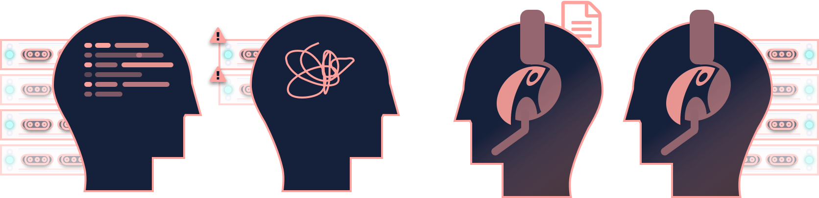
At Rackspace, I worked on the Rackspace Intelligence product team, which focused on bringing an in-depth server monitoring experience in the control panels to customers. The time finally came on the product roadmap to revamp the task of configuring monitoring alarms into a more approachable and digestible process, which I was able to lead the design efforts on.
Great for some, not so much for others

Having the monitoring alarm configuration in the UI shown as lines of code works well for advanced users. However, messing around with the literal code is off putting and overwhelming to those who don't understand it, and learning technical server monitoring concepts is not and should not be a priority to most users.
I worked with the original design team that made the design decisions on the control panels, which also set the foundation for the modern Rackspace UX design patterns. From my time with them, I was able to understand why certain things (good and bad) were designed the way they were, as well as empathized with them on the challenges in working with a very technical software development environment.
Who's trying to configure monitoring on their servers?
While there are a variety of personas and user mental models across all the Rackspace product offerings, for this redesign, we concentrated on the following groups of users:
Power users that manage fleets of servers through automation and the CLI, but use the control panel to configure monitoring alarm scripts as it is quicker
People who have a few servers whose default alarms go off as false flags, thus annoying them and creating support tickets
Customer support who manage customers' servers (paid service)
Customer support who work on customer support tickets
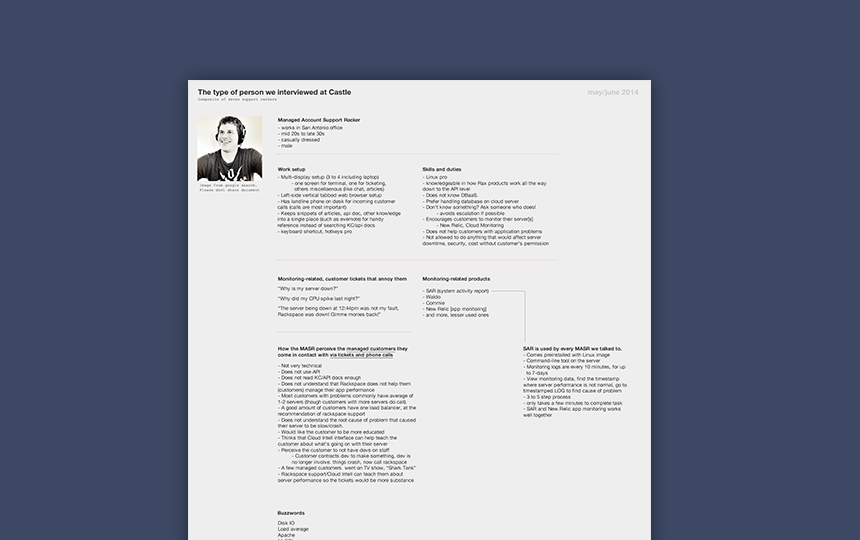
Customer support was our main source of feedback on our redesign ideas, for they interact with customers and customers’ servers. The key performance metric the redesign was attempting to reach was to have fewer server monitoring customer support tickets generated from false alarms. If the redesign can make it easier for users to understand how to set up monitoring alarms correctly, customer support would have to deal with a lot less support tickets from false flags in badly configured monitoring alarms.
During my time at Rackspace, I interviewed and shadowed customer service people through conference calls and in person at the Texas headquarters. A good set of data about their tasks, goals, and needs was gathered over time. That knowledge also was a factor in this redesign task.
Design direction

Brainstorming with the team led to some creative and interesting ideas for the redesign. But given the timeframe and how an enterprise company works in regards to any type of change to existing products, I had to be a bit more realistic and tactical in what could be accomplished in development. Here are some of the criteria that shaped the design direction:

Collaboration across product teams
Changes in how monitoring works in the web app interface need to be agreed upon by a couple of teams that have different product roadmaps and product leaders from our team. For example, any of the UI redesign ideas will most likely need the API monitoring team to spend some time tweaking their API. How much of a UI redesign can be accomplished may rely on how many changes to the API the other teams are willing to work on.

Balancing between new and established design patterns
An internal Rackspace UX design library filled with design patterns, components, and information architecture exists to unify all the product interfaces. Walking the line between sticking with convention and breaking away to design something better optimized for the problem at hand is something that a designer faces often, especially on products that existed before one joined the company. And to top it off, agreement from the internal UX library stakeholders is necessary to move forward.

Nuanced monitoring concepts
A strong understanding of the monitoring API is needed to ensure that whatever redesign does happen covers as many edge cases as we can uncover. This is especially true when trying to make sure the monitoring functions the advanced users have set on their servers in the CLI surfaces well in the web interface.
Server Monitoring UI Redesign
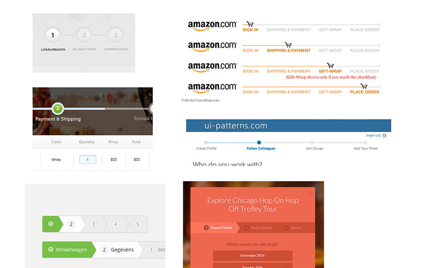
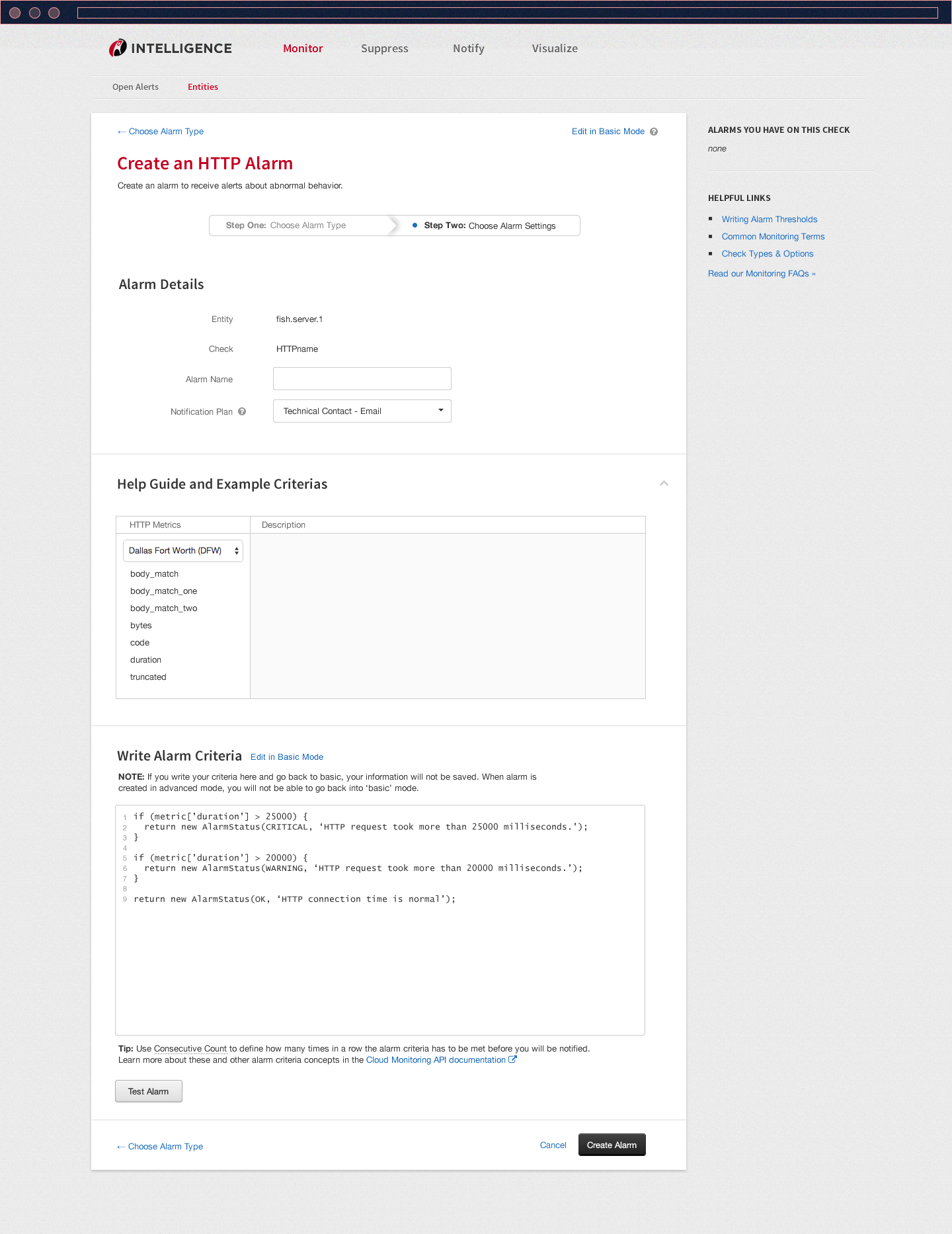
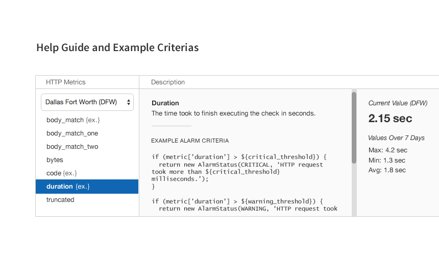
The average user is not motivated to write or edit server monitoring alarms in a coding script. As the ideation stage continued and our understanding of the monitoring API documentations increased, a team developer and I realized that the API served up simple examples of alarm coding scripts. From a technical perspective, a list of example alarms can be easily modified frequently without interrupting the other teams. If we can serve up a list of example scripts in the API, we can convert those scripts into interactive buttons, numbers, and other widgets in the web interface.
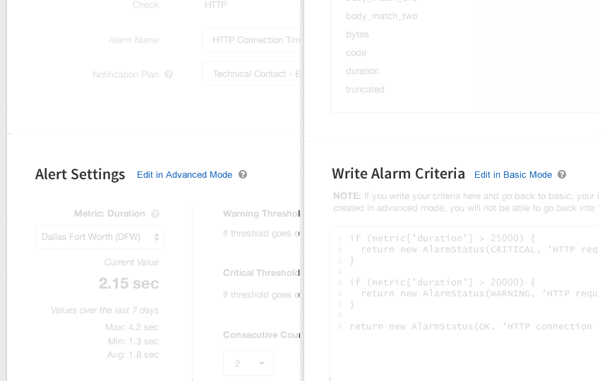
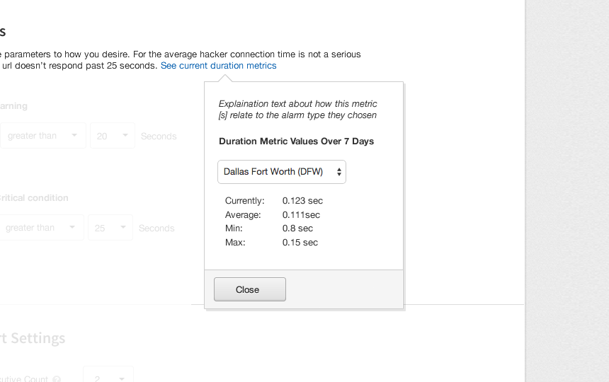
The following design shows how users, whether novice or more advanced, can modify the monitoring alarm parameters and thresholds in the web interface.
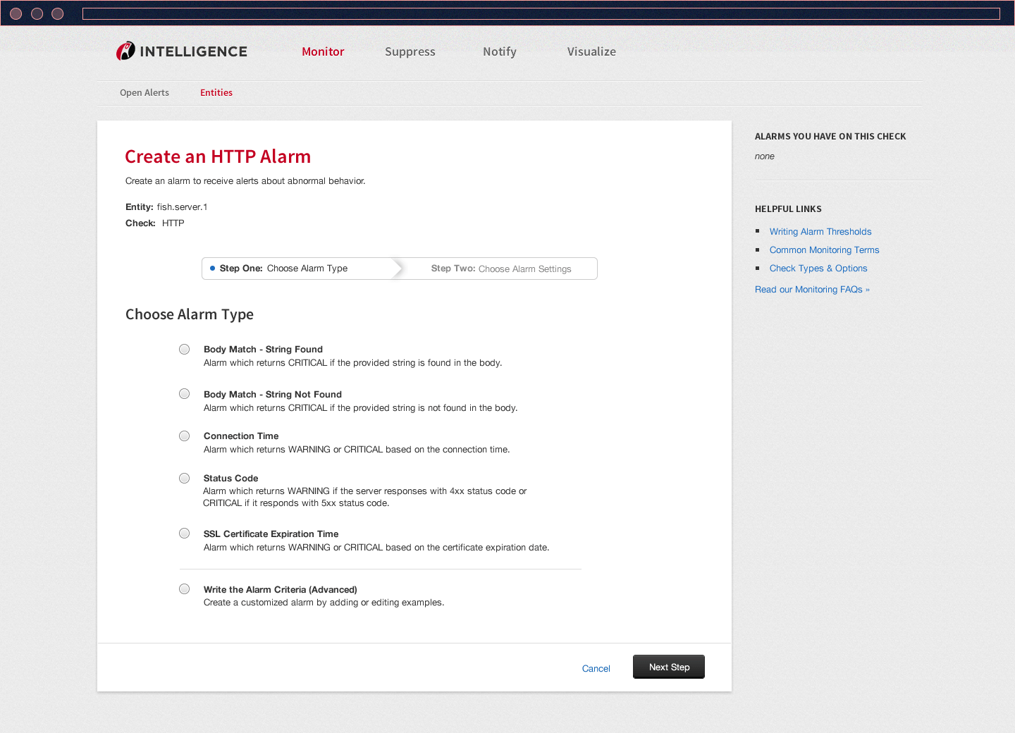
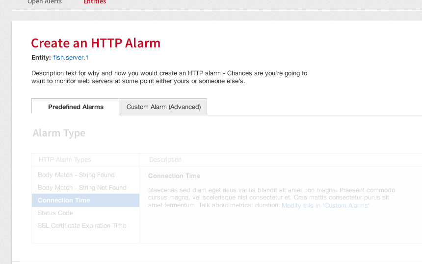
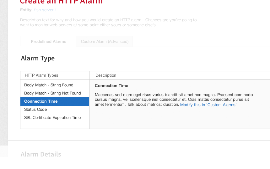
Step 1: Choose a preset alarm
The task is broken down into two steps—the first step is for the user to choose an alarm from a list that we have defined. Advanced users can also create an alarm from scratch
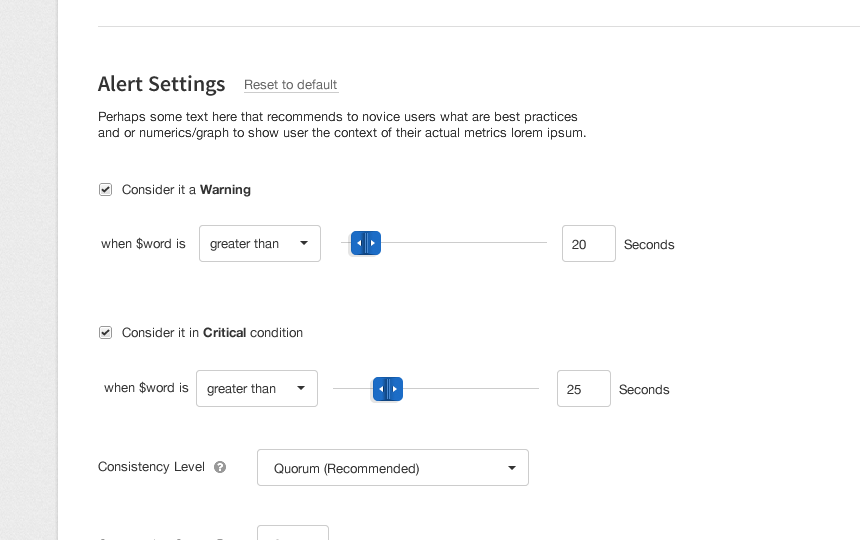
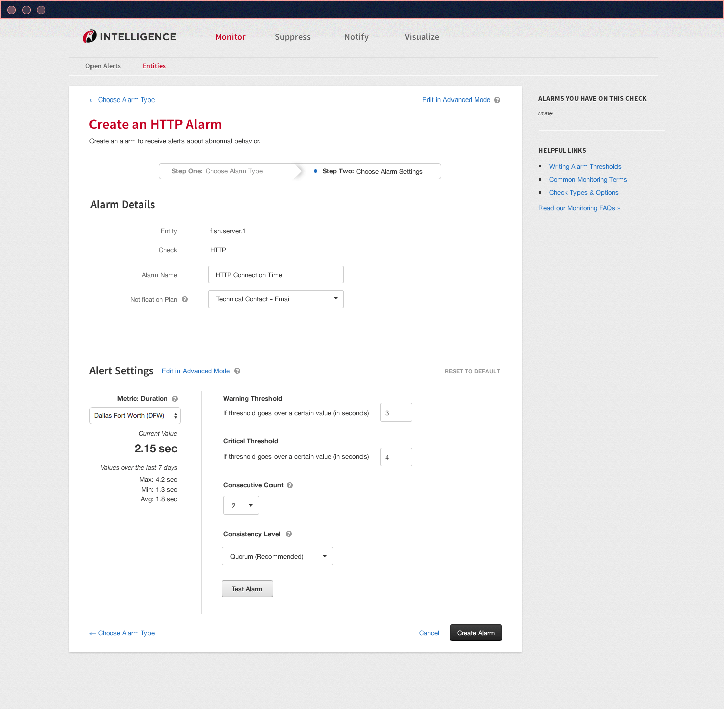
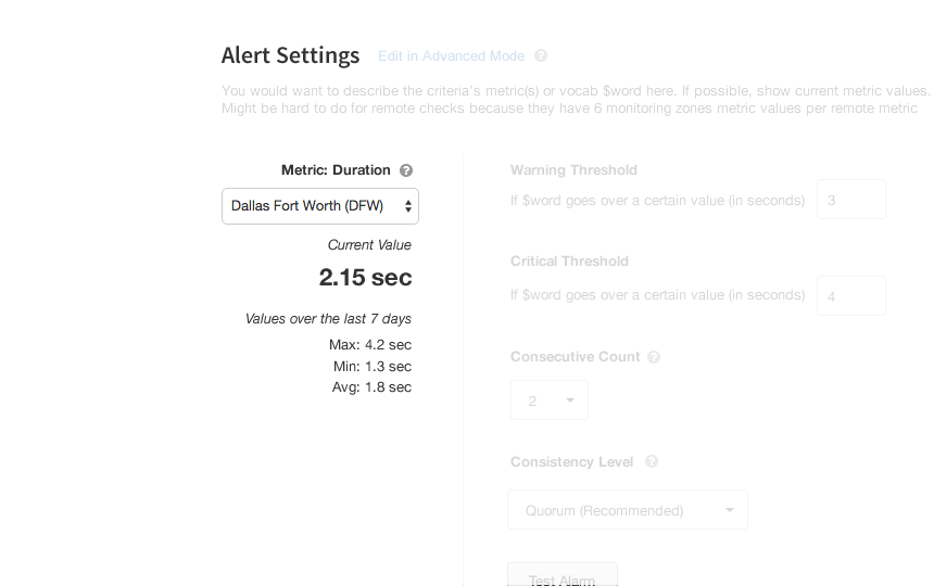
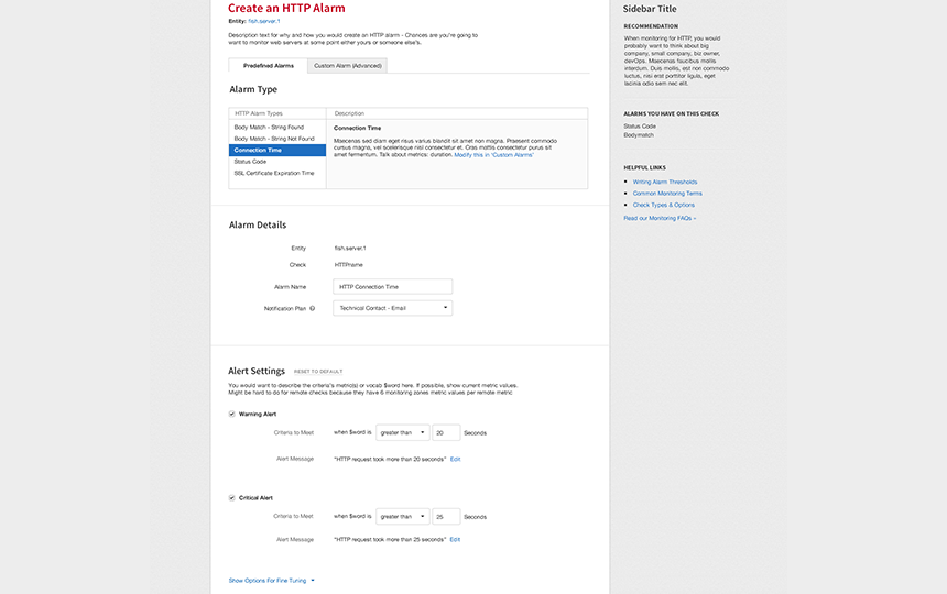
Step 2: Basic Settings
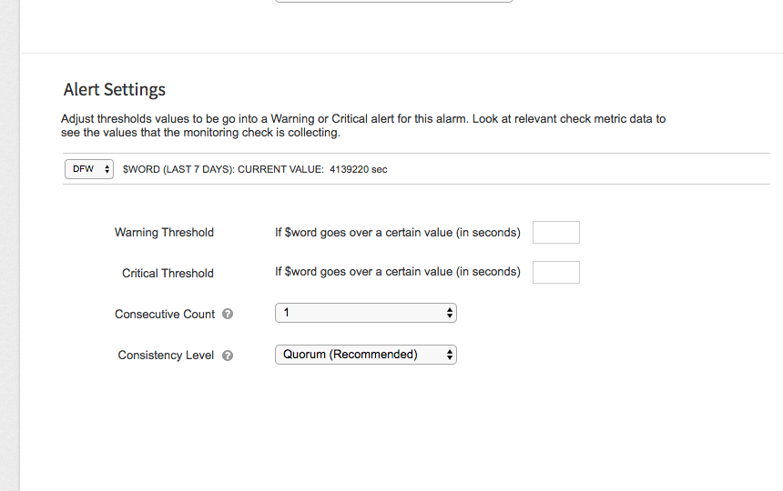
The next step is to decide on the thresholds and parameters of the alarm. Every single field is set to general default for low maintenance servers. Users can modify them to better fit the usage of their servers.
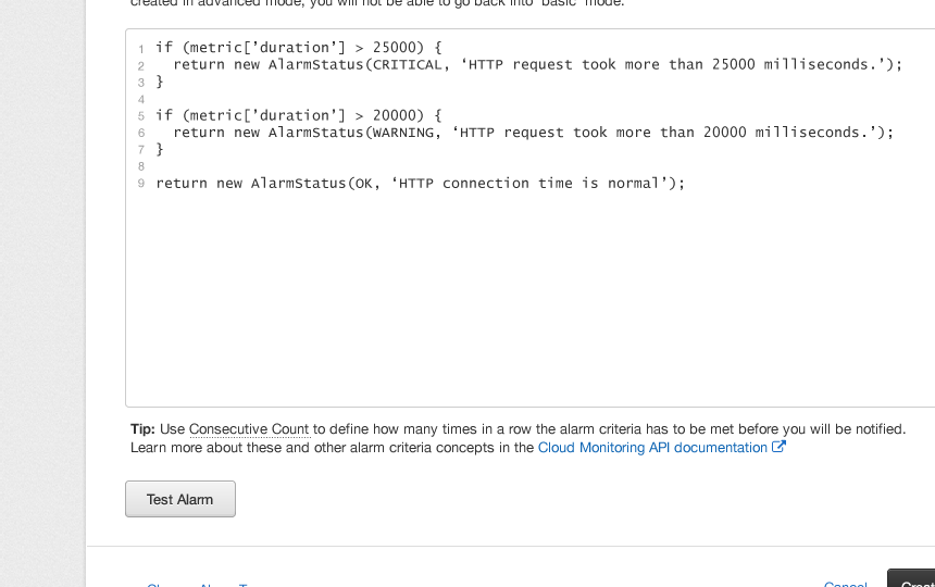
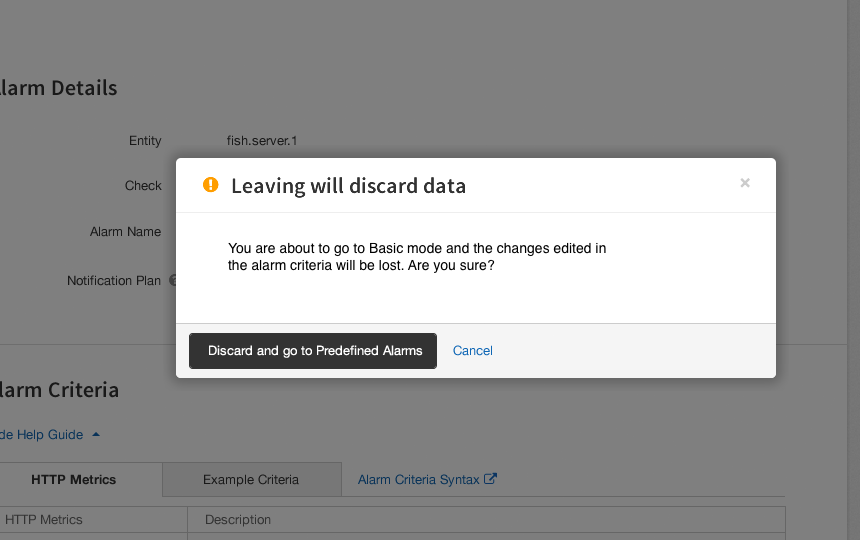
Settings for Advanced Users
For those who need more complex alarms, they can write their own. A good amount of guiding text and links help users learn how to write one.
A closer look at the design
Iterating on Feedback
To get to the redesign above, we had to gather feedback and go through a few iterations via usability testing and interviews. Collaborating with a UX researcher and another designer, we had customer support people interact with the design ideas we initially felt confident in. Here are some of them:
Play around with a UI prototype that was used early in testing:
http://bit.ly/2rGDUaU
Conclusion
The redesign was developed soon after I departed from my interaction designer role at Rackspace. From what I followed up on, the redesign did meet the goals and KPIs and affected the number of monitoring-related support tickets in customer support's weekly queue. While still not the best it could be, the redesign was a quality iteration in the right direction, as it was one of the biggest pain points of the monitoring concept since the control panel’s inception.
Case Study Q&A